DATE:
05/04/2026
LENGTH:
12 WEEKS
ROLE:
SOLO
SERVICE:
PRODUCT DESIGNER, UI/UX DESIGNER
Drift
about.
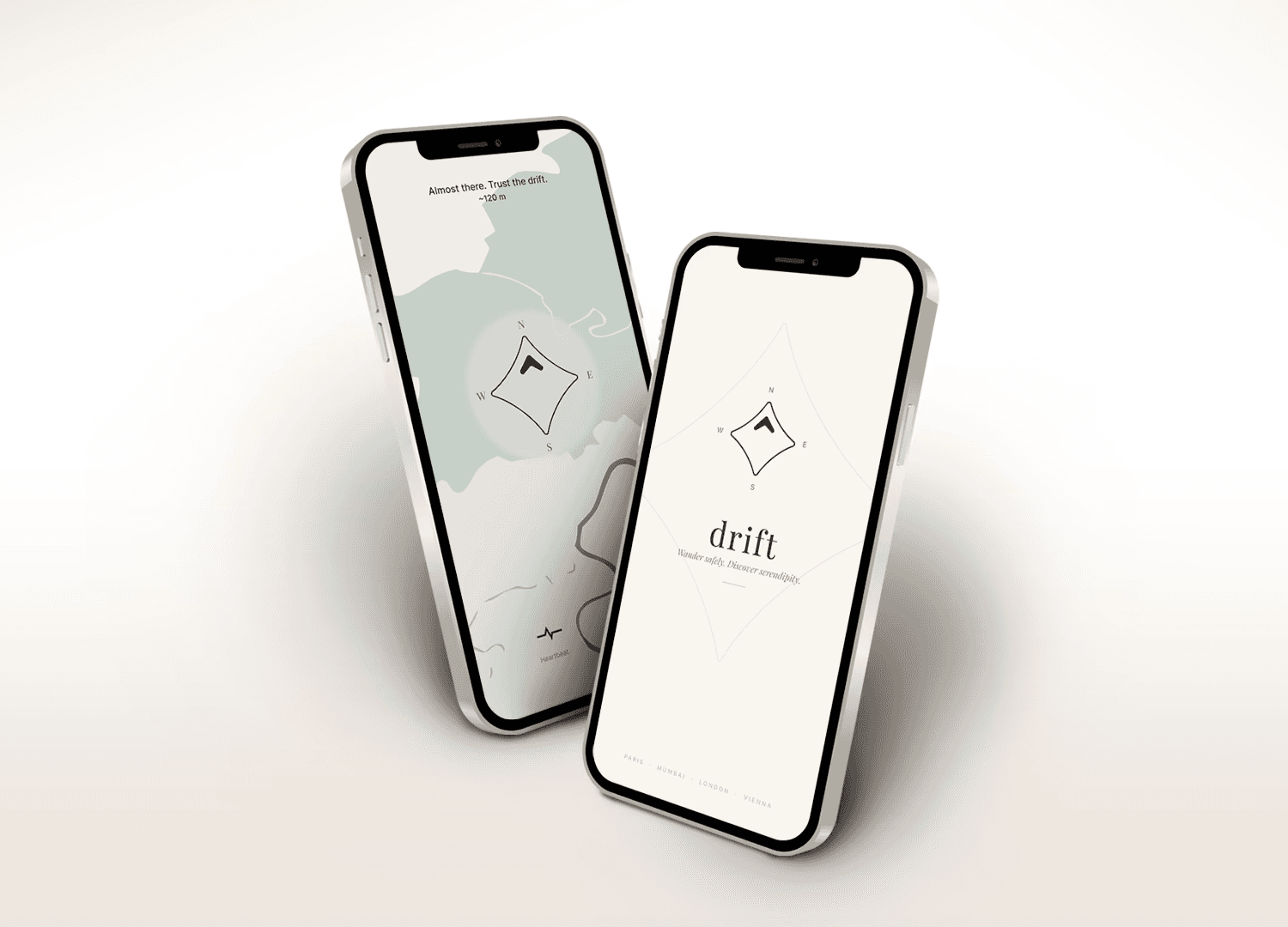
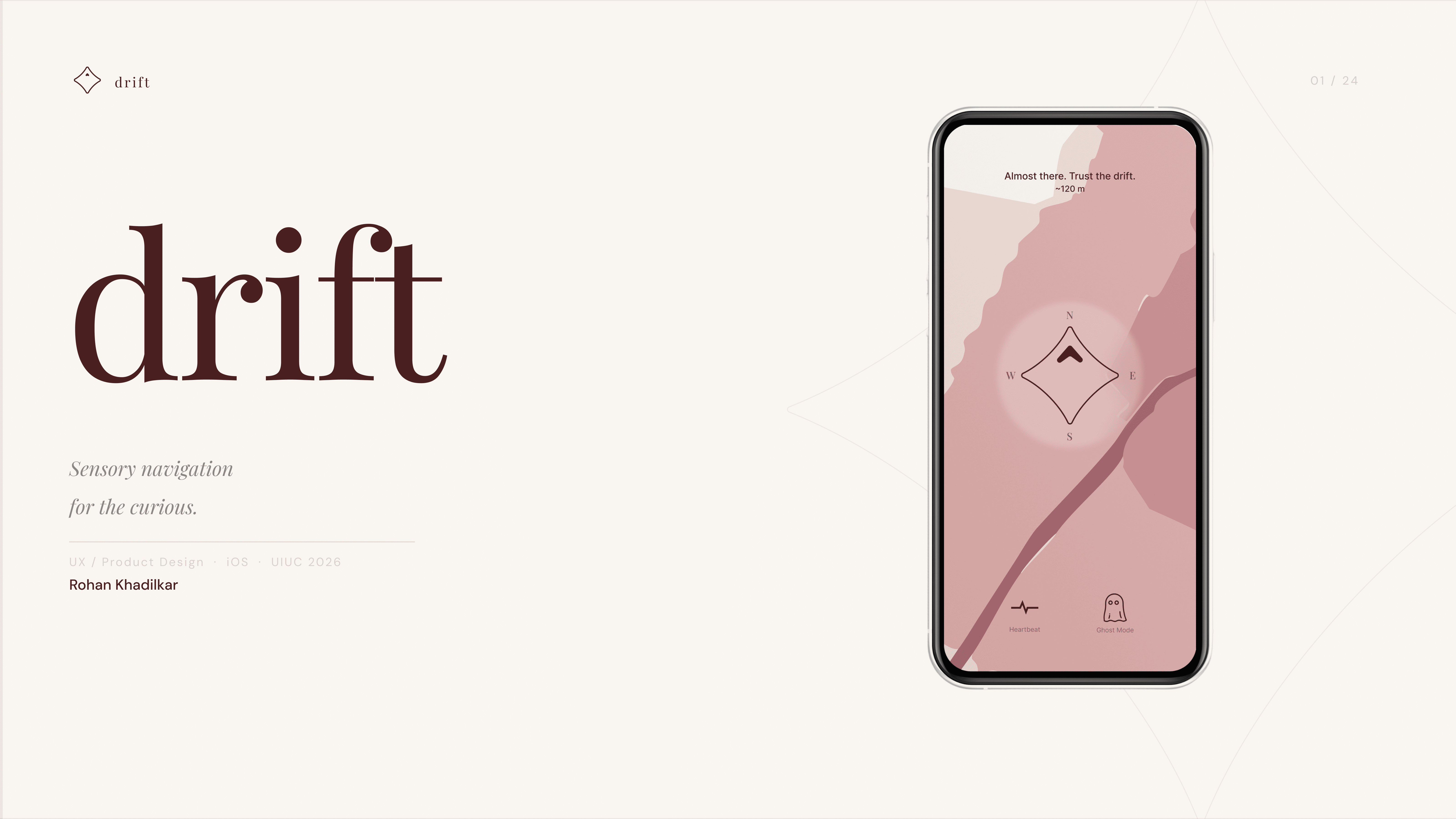
drift is a sensory navigation app for solo travelers and urban explorers who want to actually experience a city rather than tick off a list. Instead of routing you to a destination, it hands you a compass and a vibe and lets the city do the rest. You pick a mood, set a time, and start walking. The destination reveals itself only when you arrive.
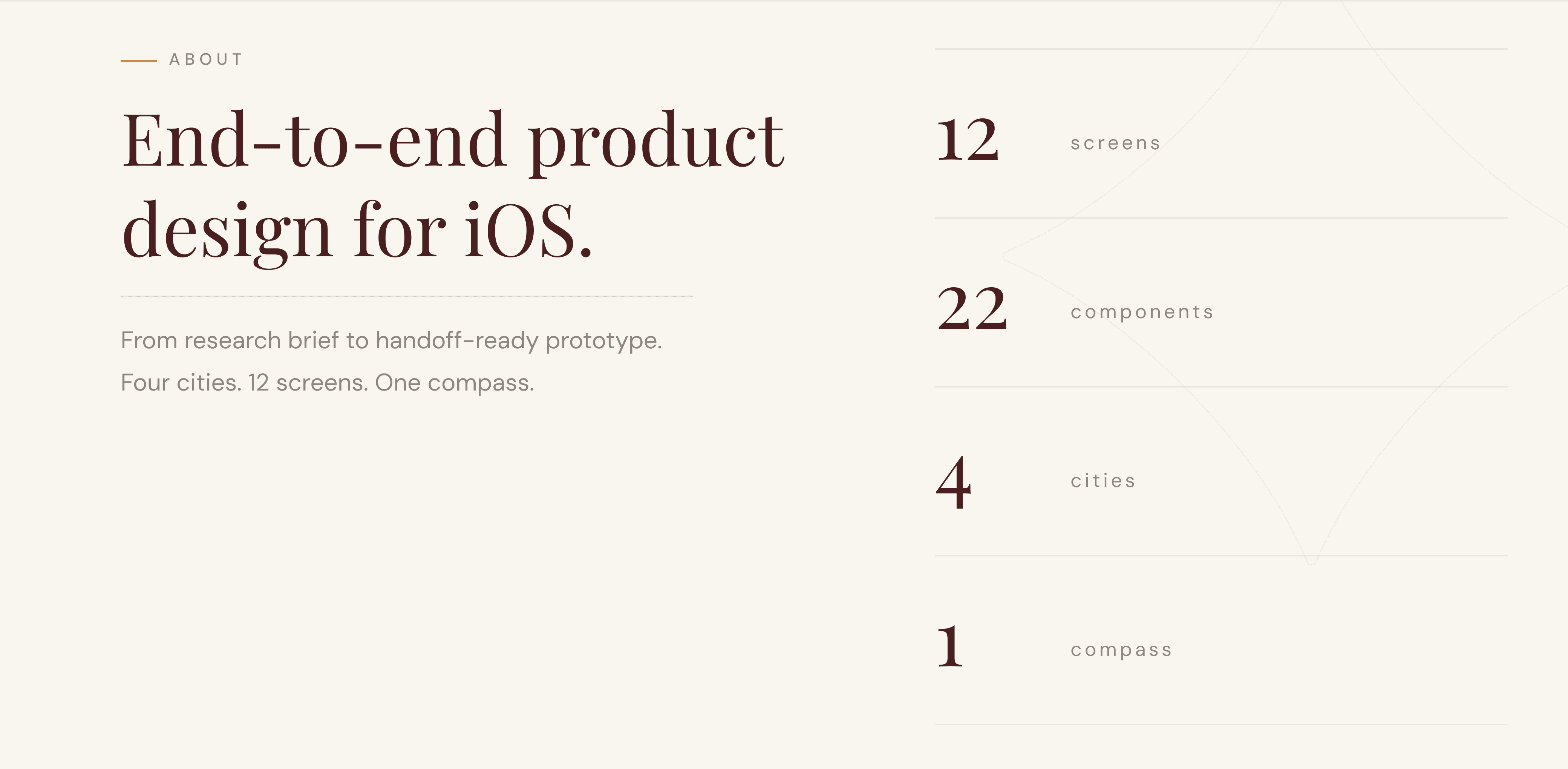
The project covers end-to-end product design — research, UX strategy, a complete iOS prototype across 12 screens, a full design system, and a four-city branding suite.
challenge.
Navigation apps optimize for one thing: getting you somewhere fast. Constant on-screen feedback, the most efficient route, 4,000 people routed to the same café. What they don't account for is you — your mood, your energy, your curiosity about what's down the next street.
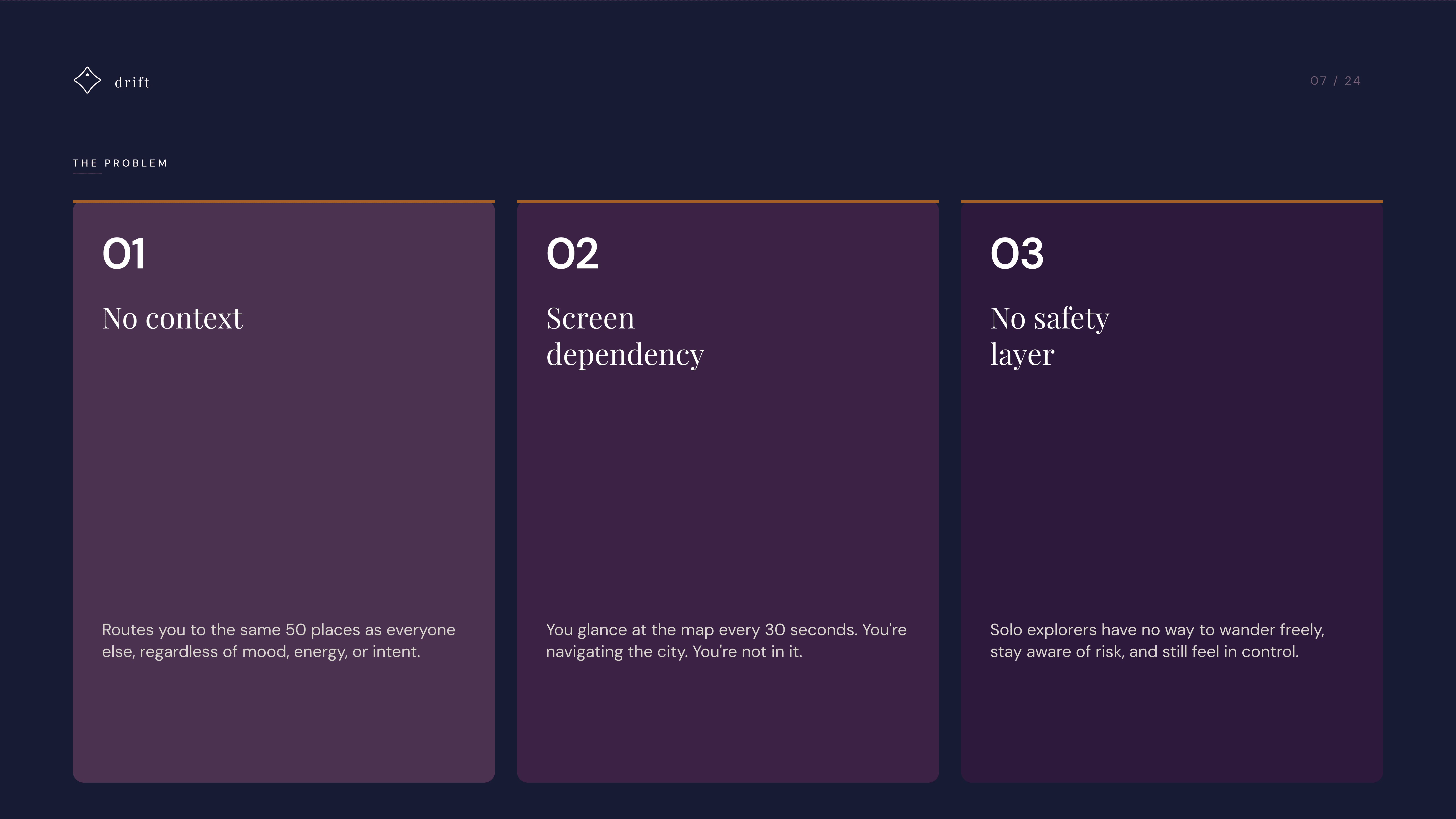
The result is three compounding problems. First, no context: every app sends you to the same 50 places regardless of who you are or what you're looking for. Second, screen dependency: you're glancing at a map every 30 seconds, navigating the city without ever actually being in it. Third, no safety layer: solo explorers have no way to wander freely, stay aware of risk, and still feel in control.
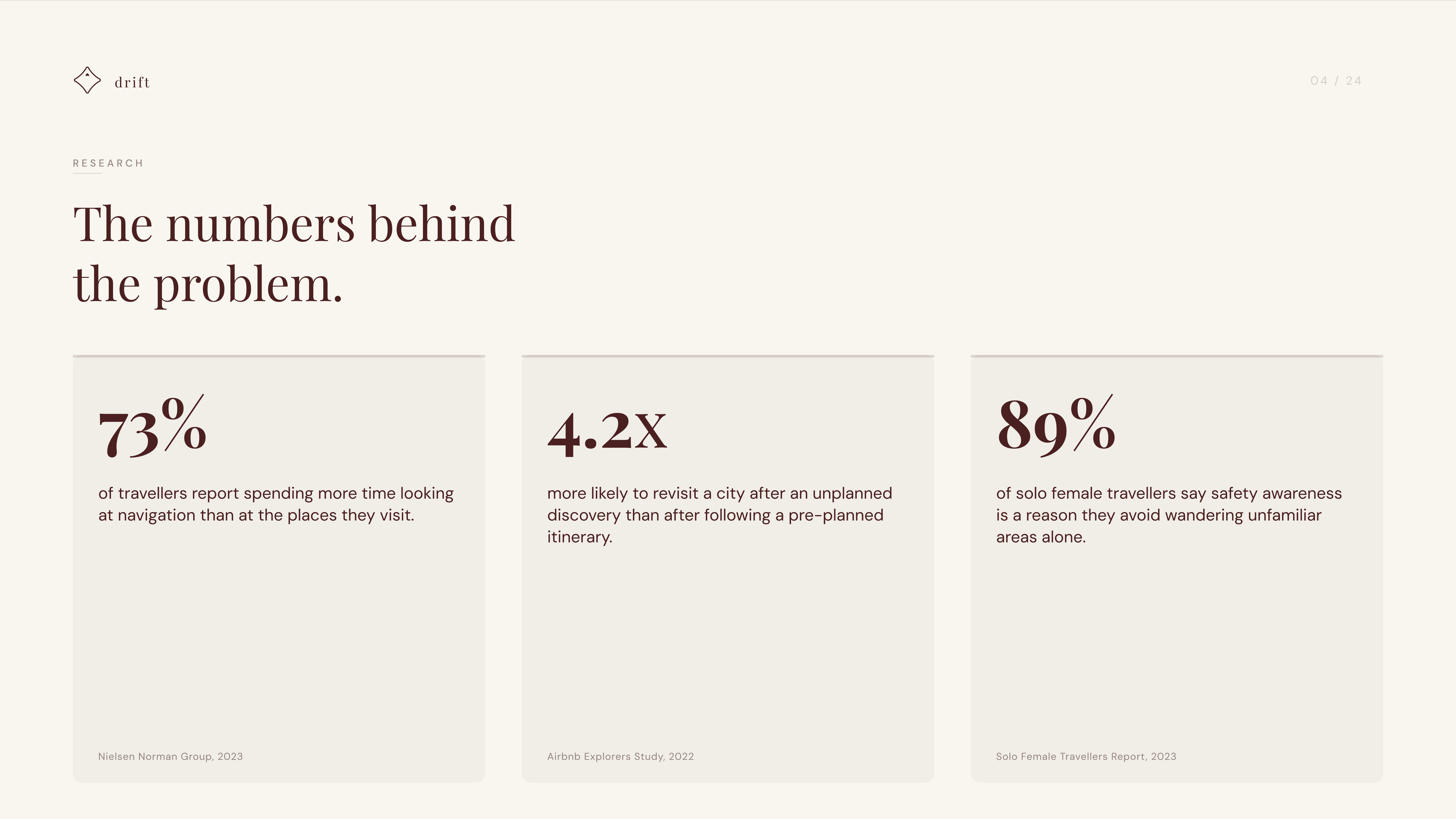
The numbers make it concrete. 73% of travelers spend more time looking at navigation than at the places they're visiting. Unplanned discovery is 4.2x more likely to bring someone back to a city than a pre-planned itinerary. And 89% of solo female travelers cite safety awareness as a reason they avoid wandering unfamiliar areas alone.
The design challenge was to build something that treats wandering as the feature, and makes it feel safe enough that people actually do it.
user.
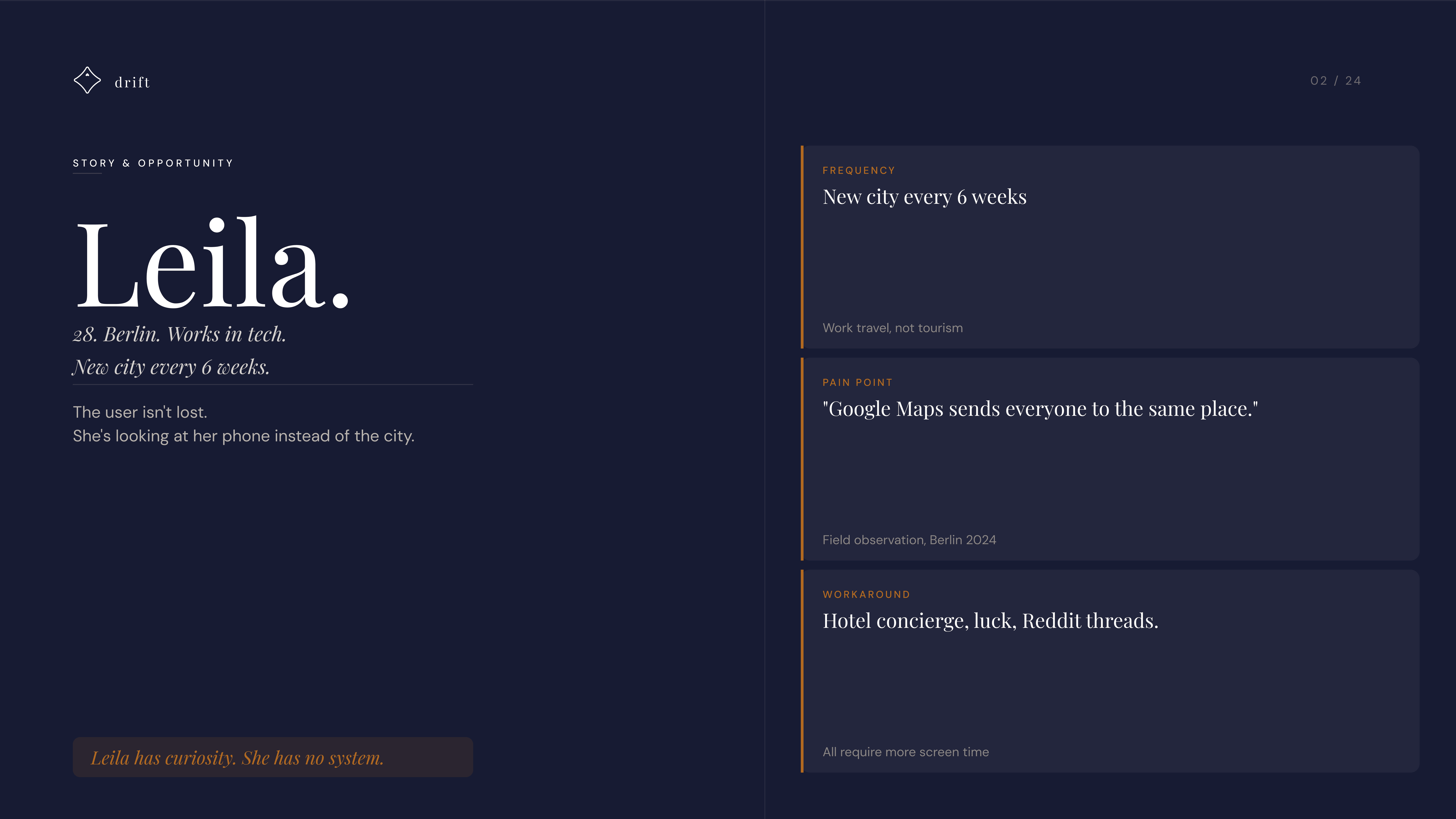
The primary user is Leila. 28, Berlin, works in tech, new city every six weeks. She's not a tourist. She's curious, time-limited, and tired of ending up at the same places as everyone else.
Her workaround is hotel concierges, luck, and Reddit threads. Her pain point, observed in the field: "Google Maps sends everyone to the same place." Leila has curiosity. She has no system.
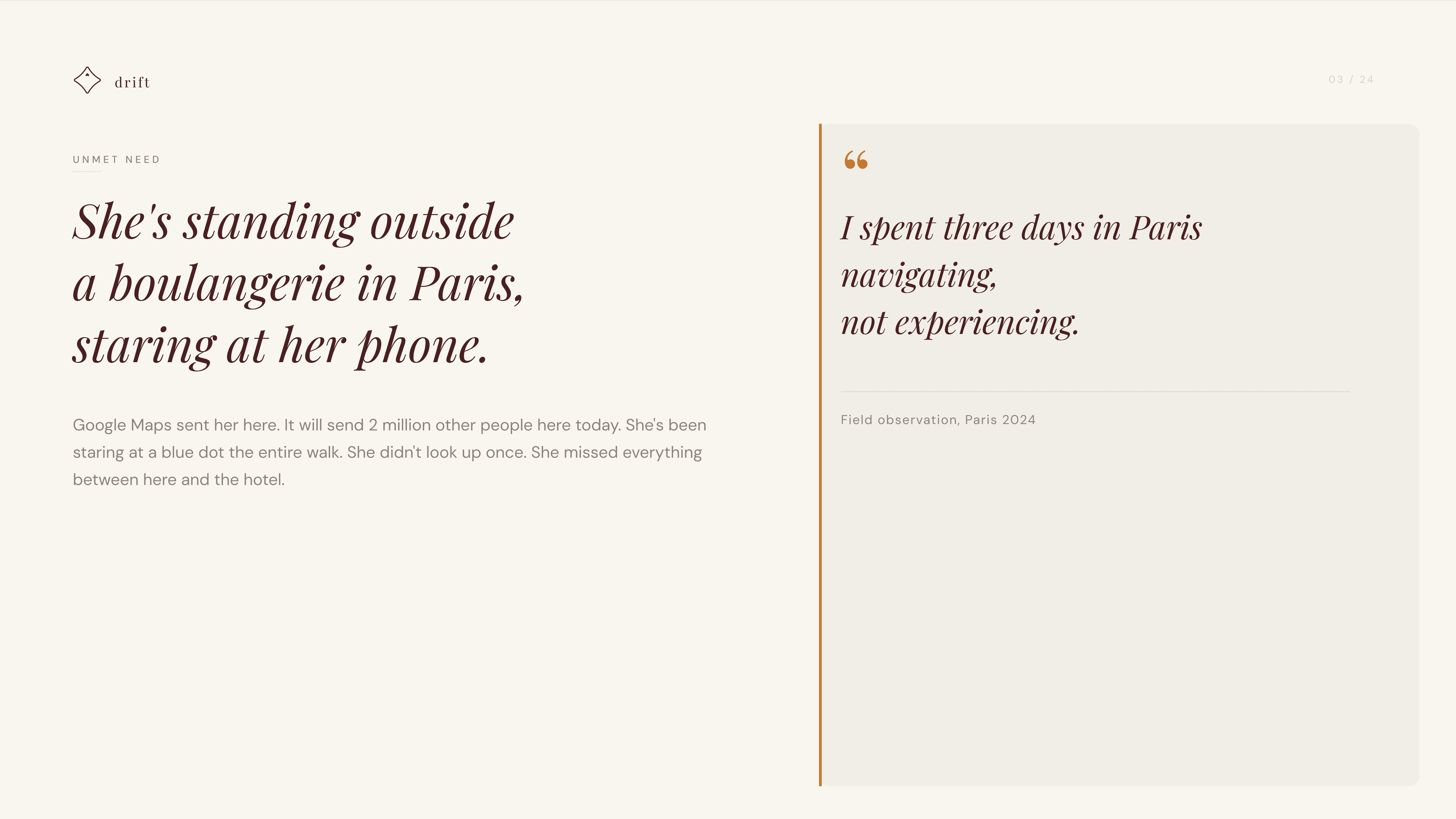
The image says it all: she's standing outside a boulangerie in Paris, staring at her phone. Three days in the city, navigating, not experiencing.
research & exploration.
Research confirmed what the persona suggested: people don't dislike cities, they dislike how navigation apps make them experience cities. Four user interviews kept surfacing the same phrase: "navigating, not experiencing."
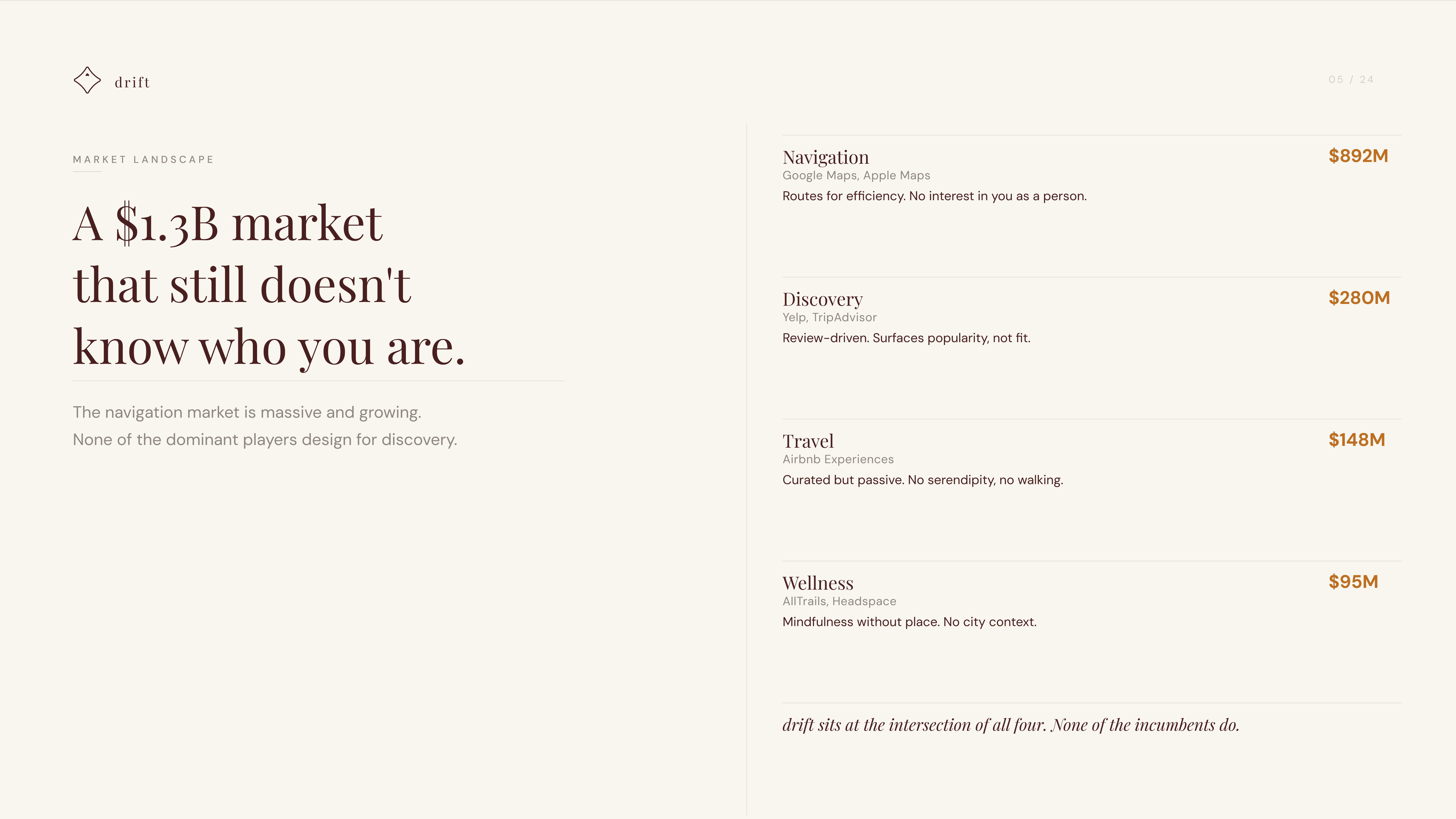
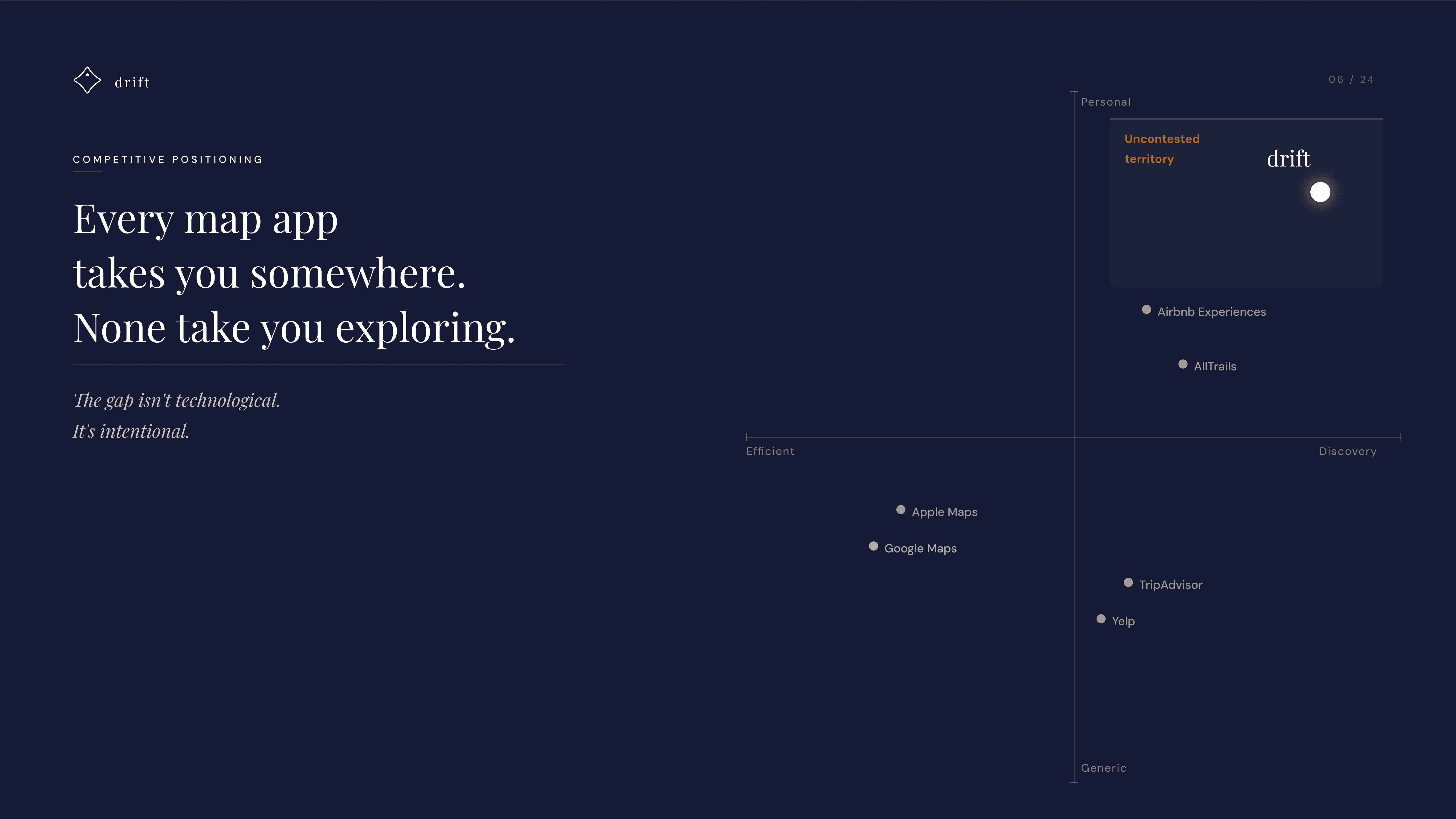
The market landscape made the opportunity clear. Navigation ($892M), Discovery ($280M), Travel ($148M), Wellness ($95M). A $1.3B space, and none of the dominant players design for mood, serendipity, or wandering. The top-right quadrant, high discovery and high personal, was completely empty.
Every map app takes you somewhere. None take you exploring. Drift sits at the intersection of all four categories. The gap isn't technological. It's intentional.
value proposition.
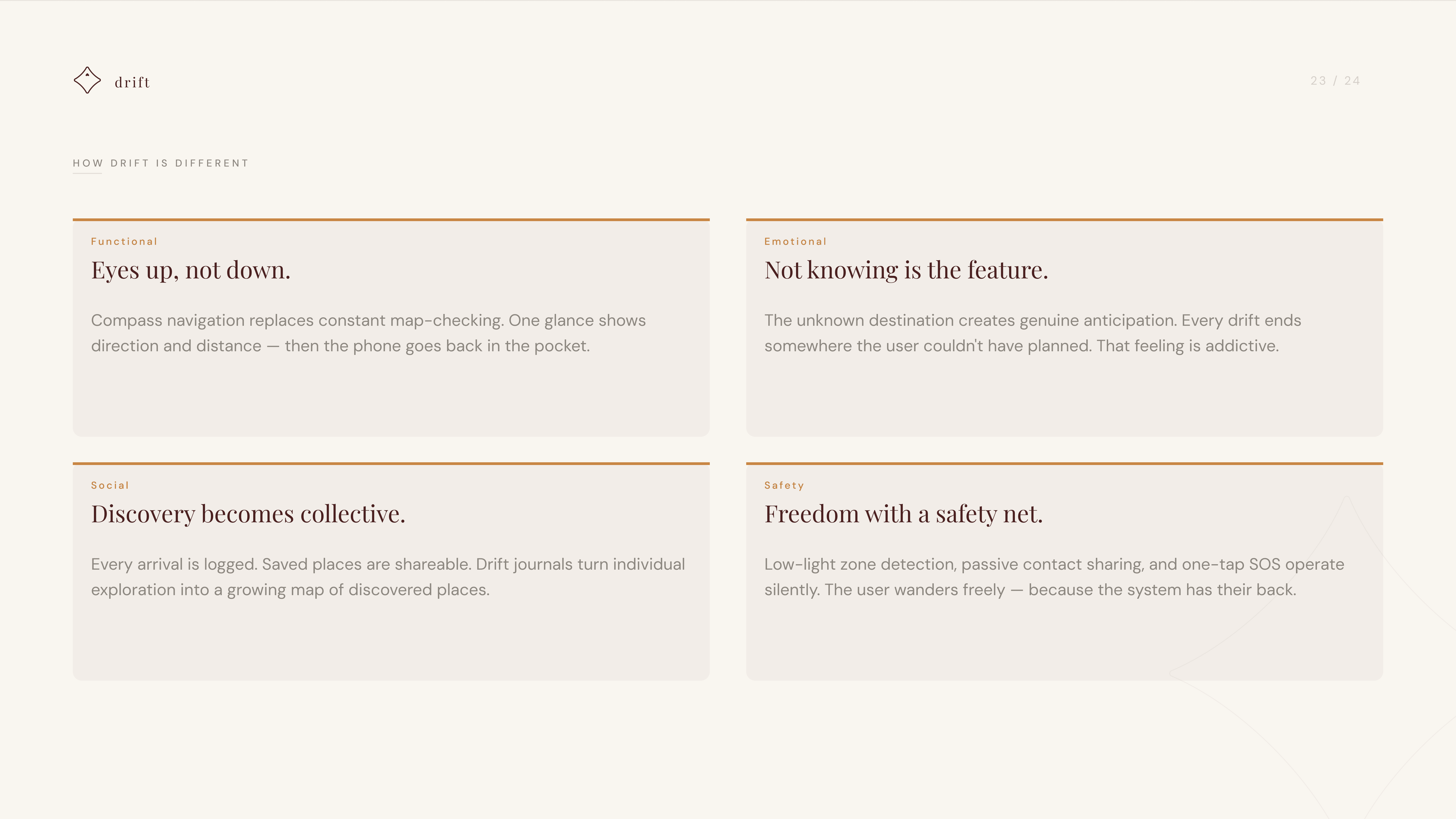
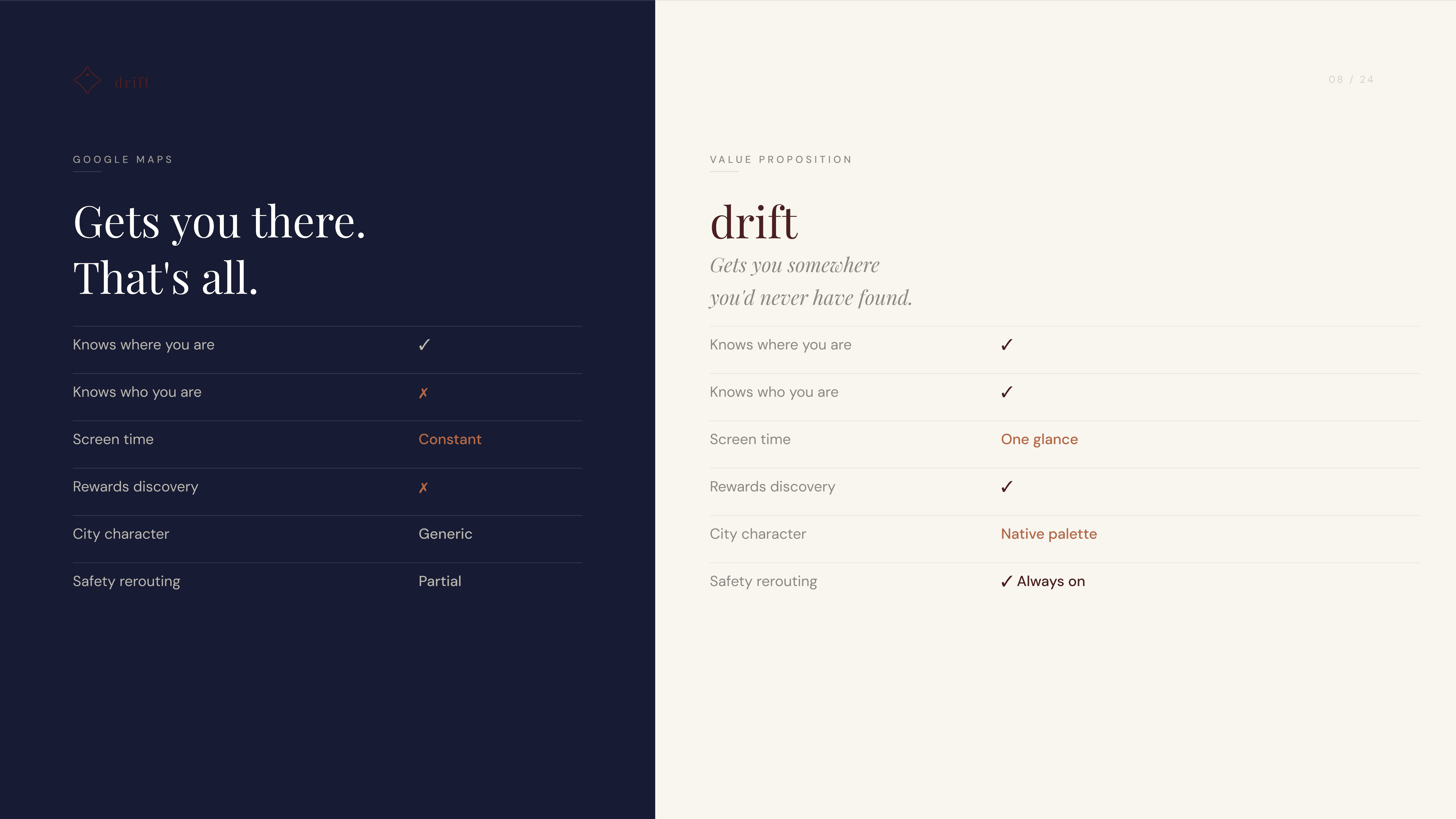
Google Maps knows where you are. That's it. It doesn't know who you are, it demands constant screen attention, it doesn't reward discovery, it treats every city the same, and safety rerouting is only partial.
Drift does all of it. Same location awareness, but it also knows who you are, asks for one glance instead of constant monitoring, actively rewards discovery, reflects each city's native character, and keeps safety rerouting always on.
Google Maps gets you there. Drift gets you somewhere you'd never have found.
experience flow.
The core flow is intentionally short. Six steps from launch to arrival, and only the first two require any interaction. After that, the phone goes in the pocket.
Step one: set your vibe and duration. Quiet, historical, lively. 20 to 90 minutes. Step two: optional haptics for hands-free navigation. Step three: glance at the compass once, eyes up, explore the city.
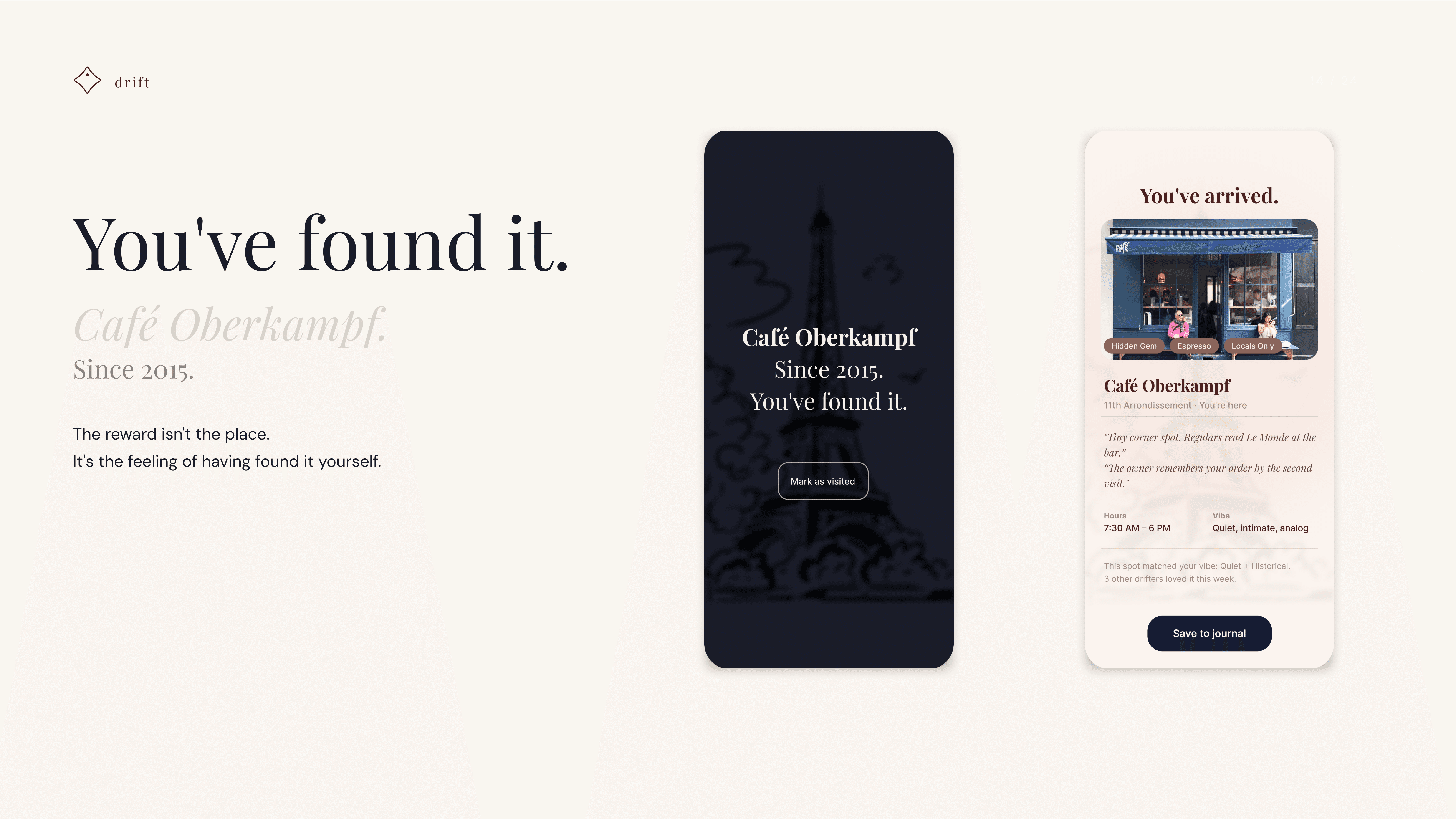
What Leila feels along the way tracks four states. Curiosity at the start, a vibe and a time limit but no destination, and the constraint is freeing. Presence as she walks, a compass glance every few minutes while the city fills her peripheral vision. Anticipation as the compass points insistently and she walks faster without knowing what she's approaching. Discovery when the screen lights up and she's arrived somewhere she would have chosen herself.
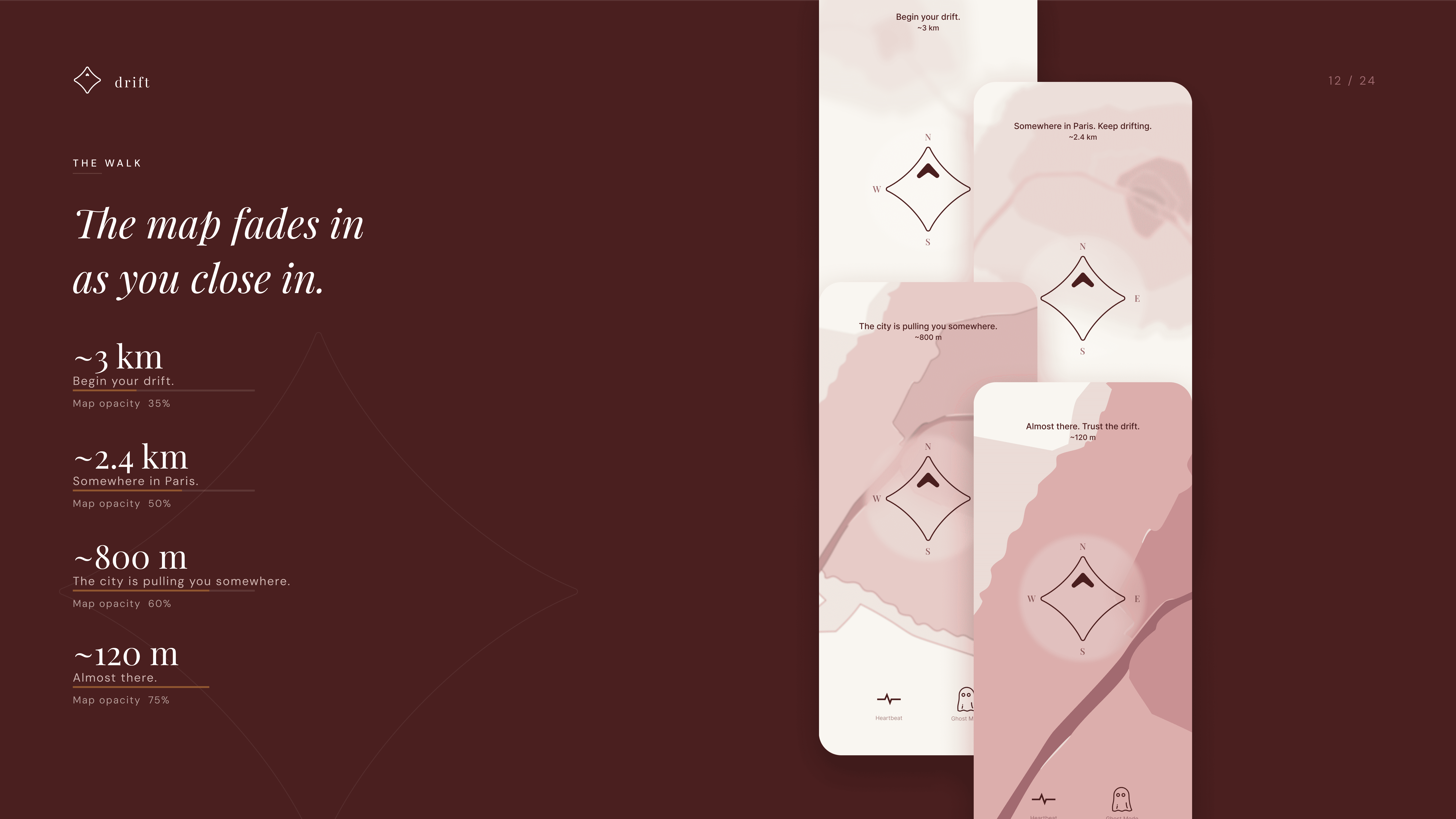
The map fades in as she closes in. At 3 km, 35% opacity. At 800 m, 80%. At 120 m, almost there, 95%. The city reveals itself gradually. She never stares at a dot.

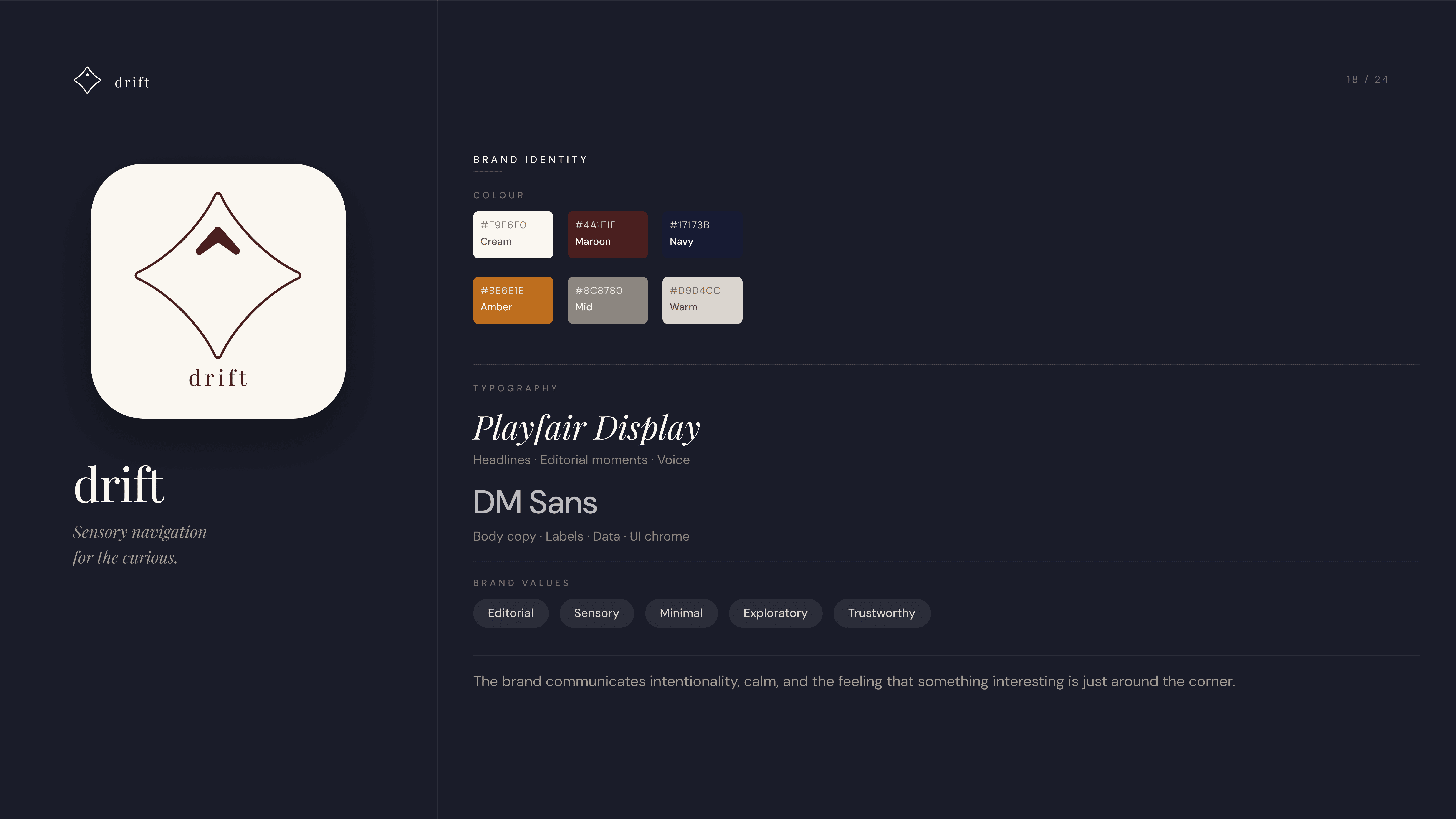
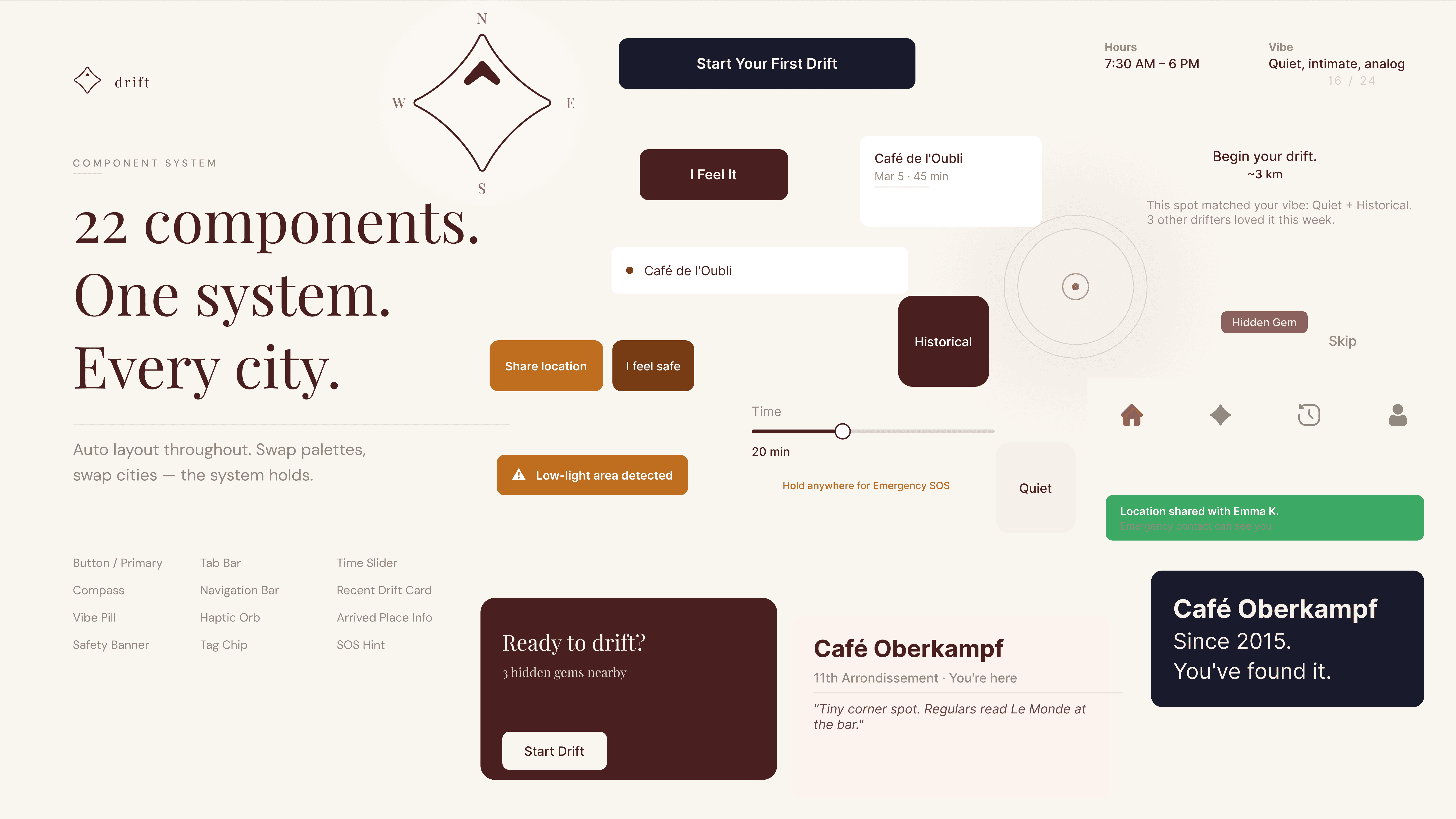
identity & components.
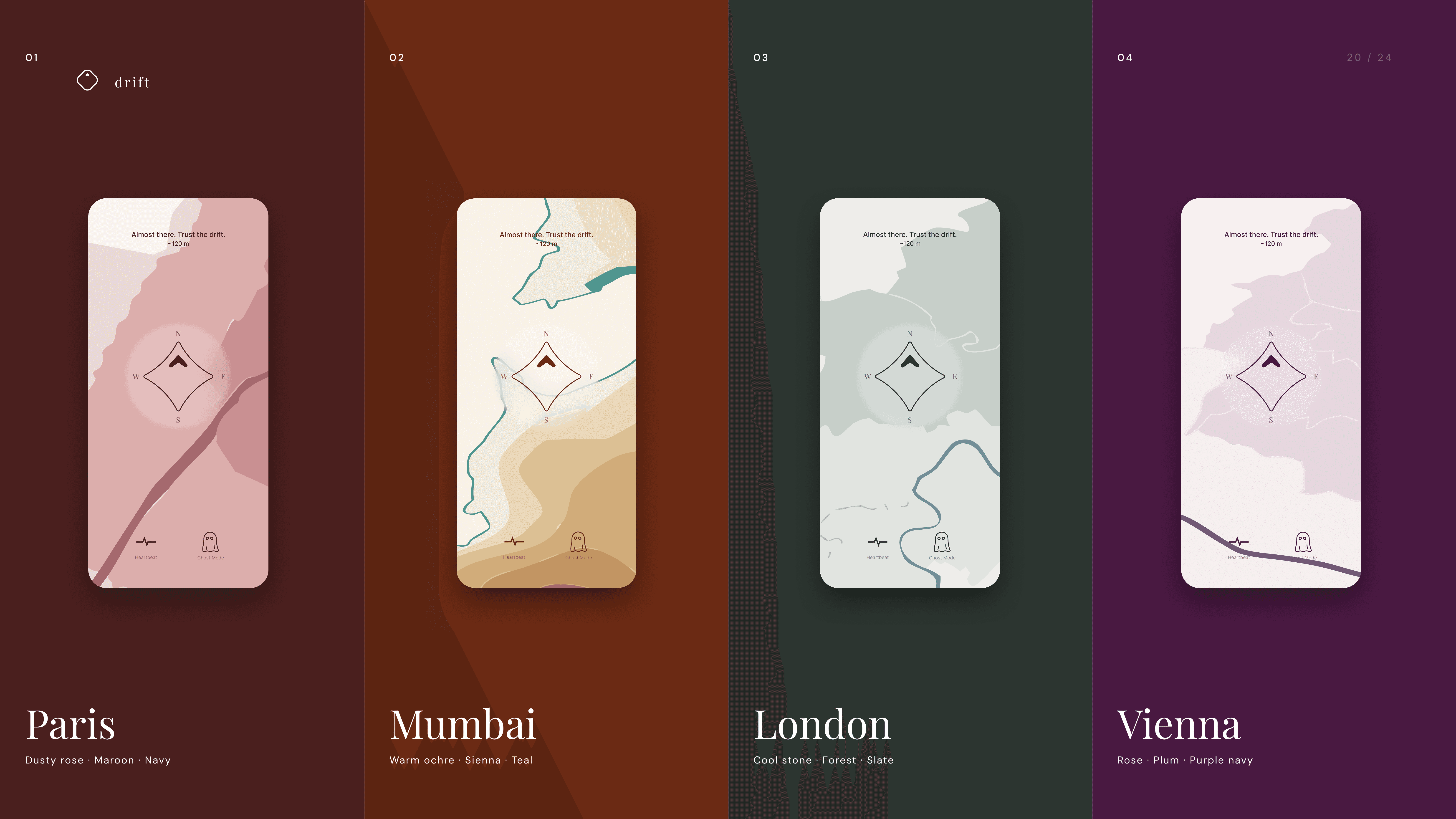
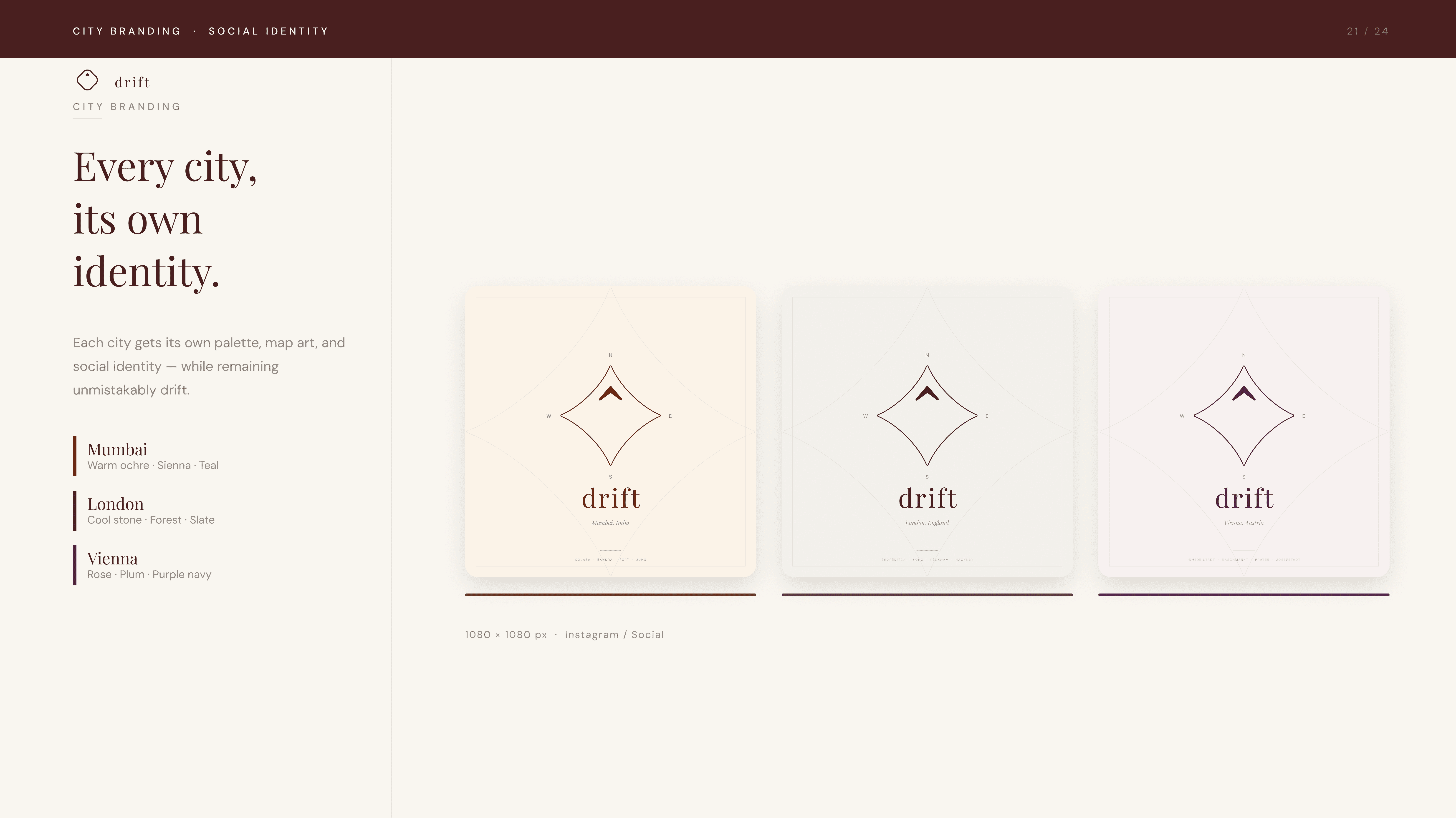
city expansion.
result.
Drift demonstrates that restraint is a design decision. Removing the map, hiding the destination, and surfacing safety passively aren't compromises. They're the product. Every screen asks the same question: what's the minimum the user needs to keep walking?
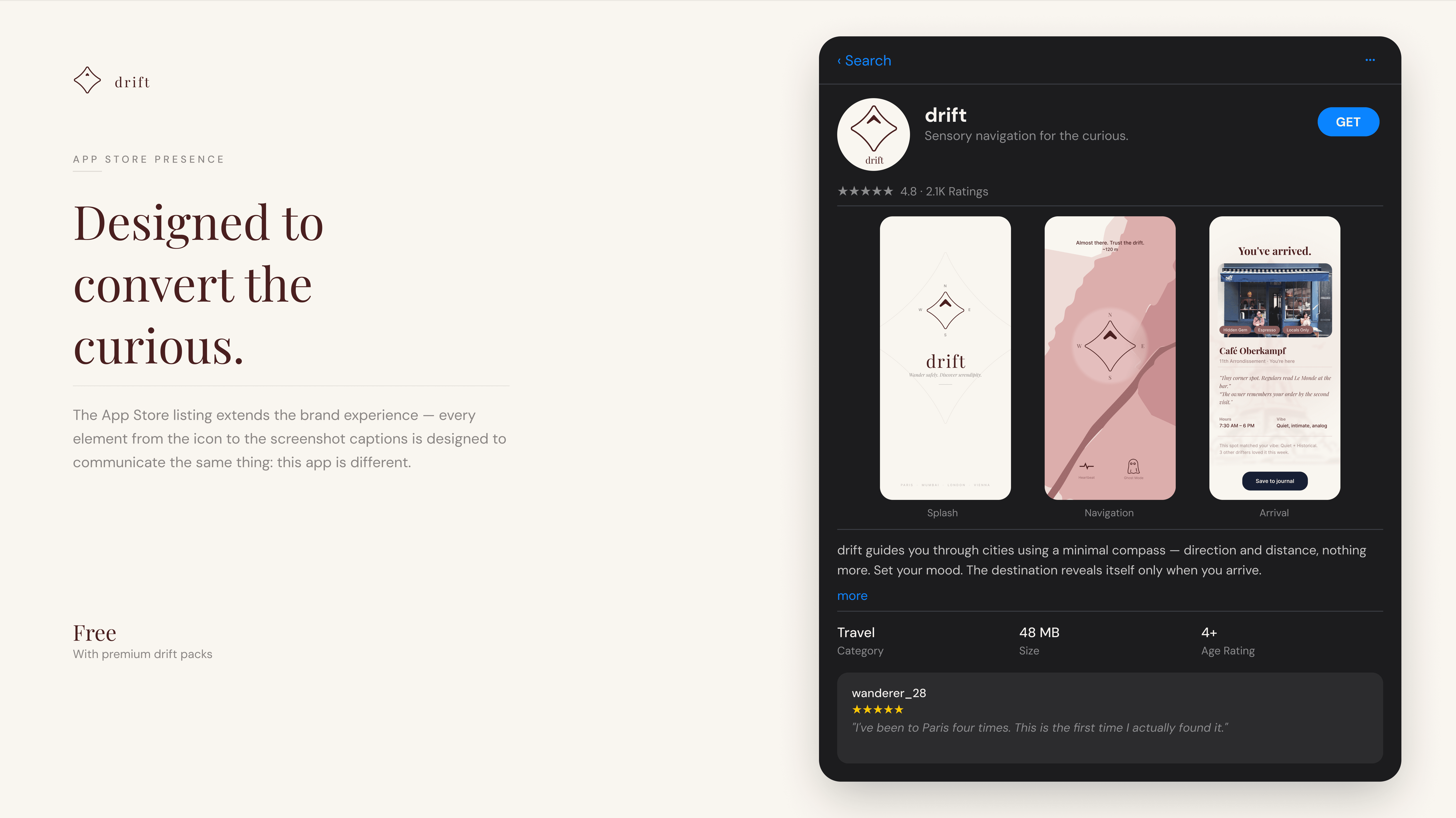
The prototype shipped as a handoff-ready iOS file. Components named and organized, auto layout throughout, four city variants each with their own palette and map illustration. The branding system extends to App Store presence, social identity, and hero banners for each city.
If the project continued: live compass integration via device gyroscope, city expansion with Tokyo and New York already scoped, and a drift journal that builds a personal map of everywhere you've been.
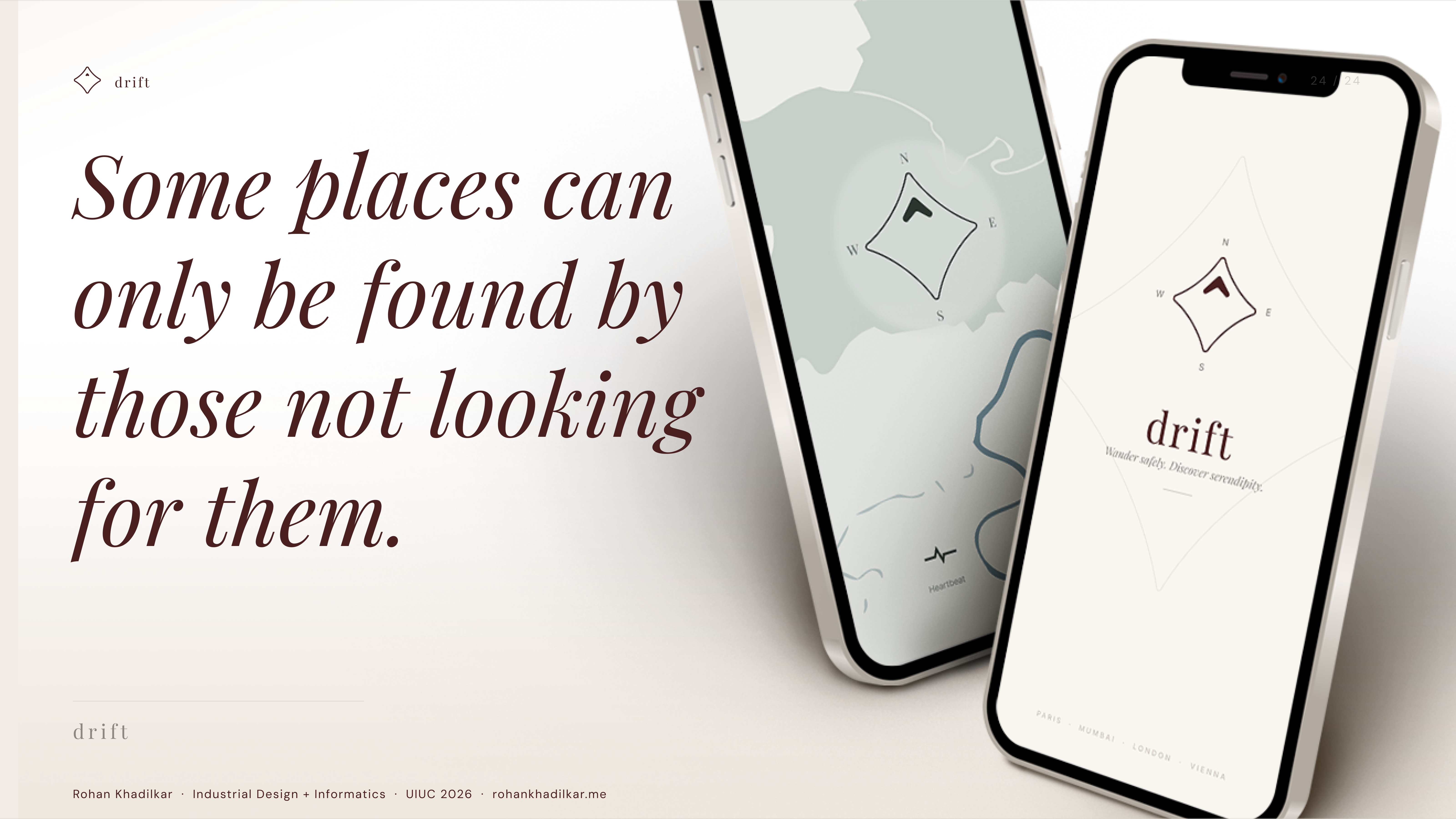
Some places can only be found by those not looking for them.