DATE:
05/06/2026
LENGTH:
10 WEEKS
ROLE:
SOLO
SERVICE:
PRODUCT DESIGNER, UI/UX DESIGNER
Slate
about.
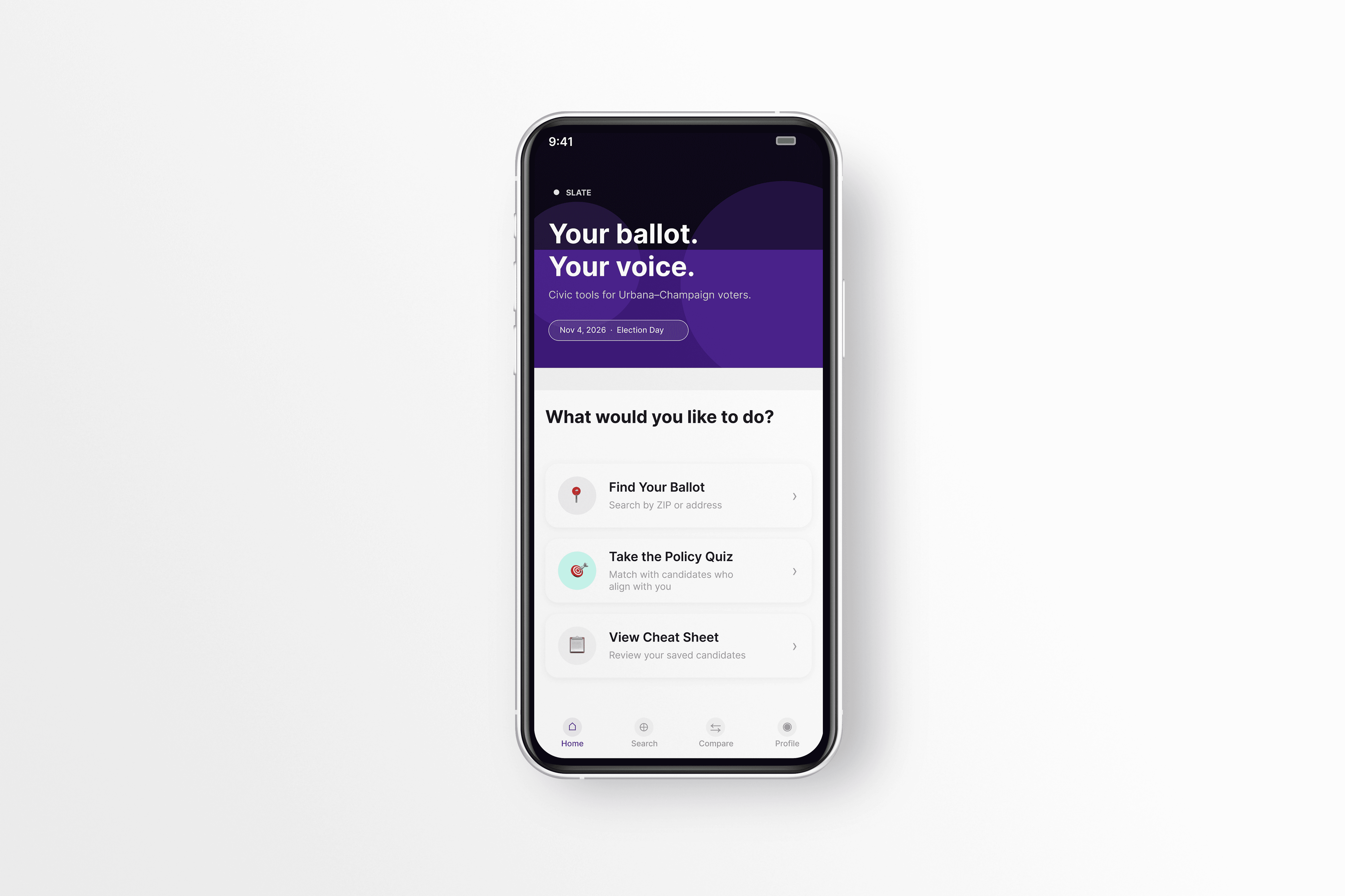
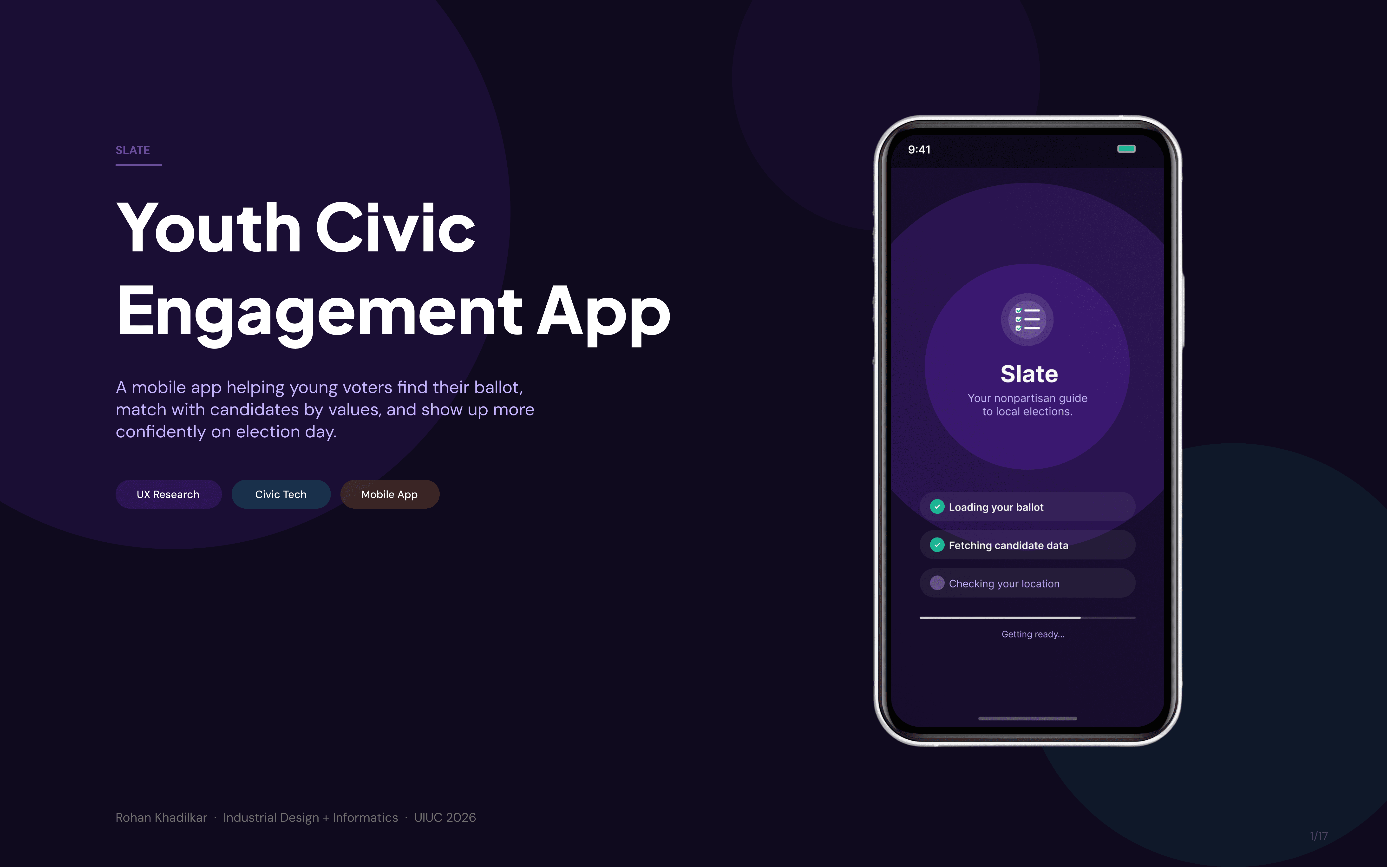
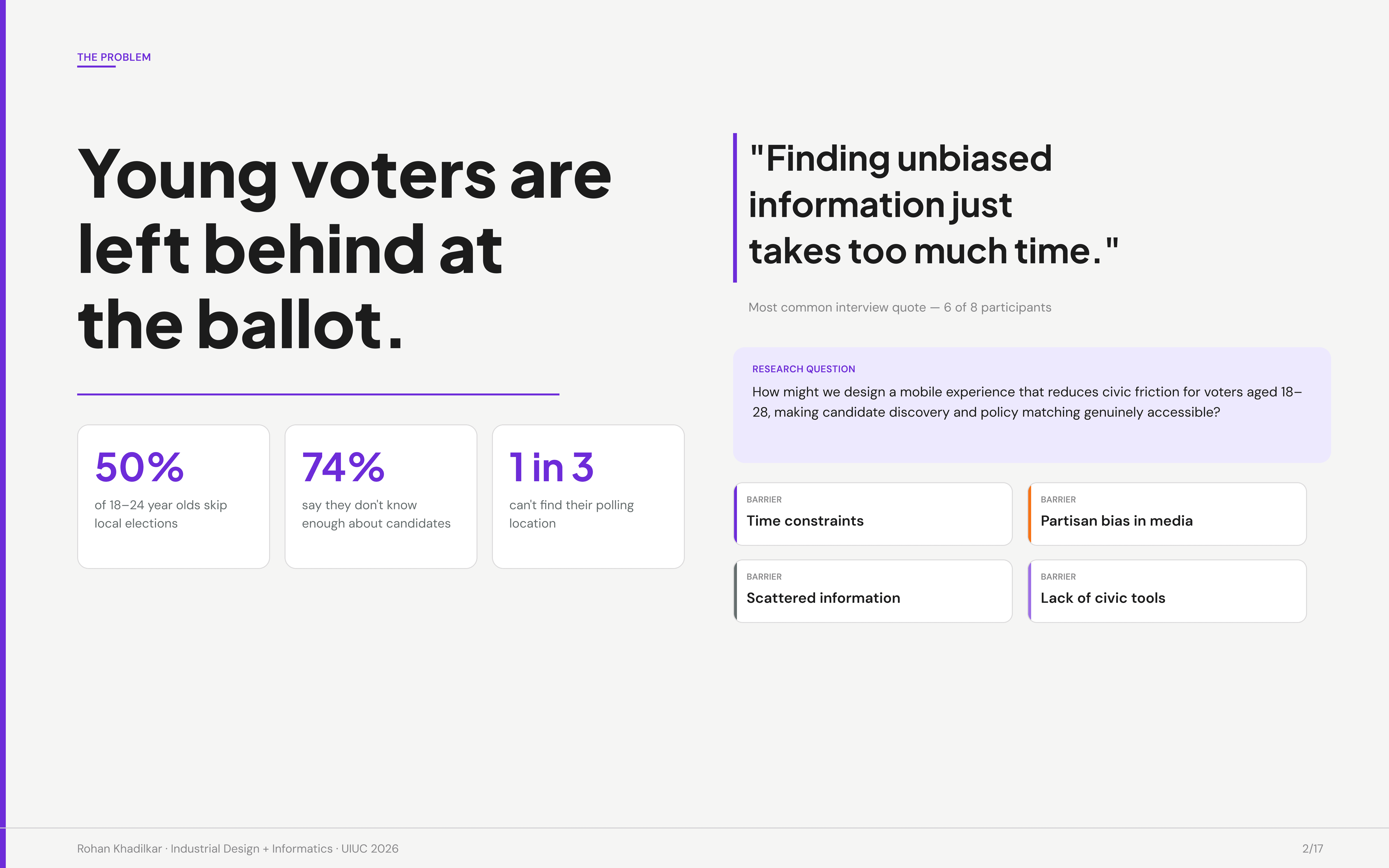
Slate is a civic tech mobile app that helps young voters find their ballot, match with candidates by values, and show up more confidently on election day. Local elections consistently see the lowest youth turnout, but the data tells a more specific story: 50% of 18 to 24 year olds skip local elections, 74% say they don't know enough about candidates, and 1 in 3 can't find their polling location. The problem is a broken research experience.
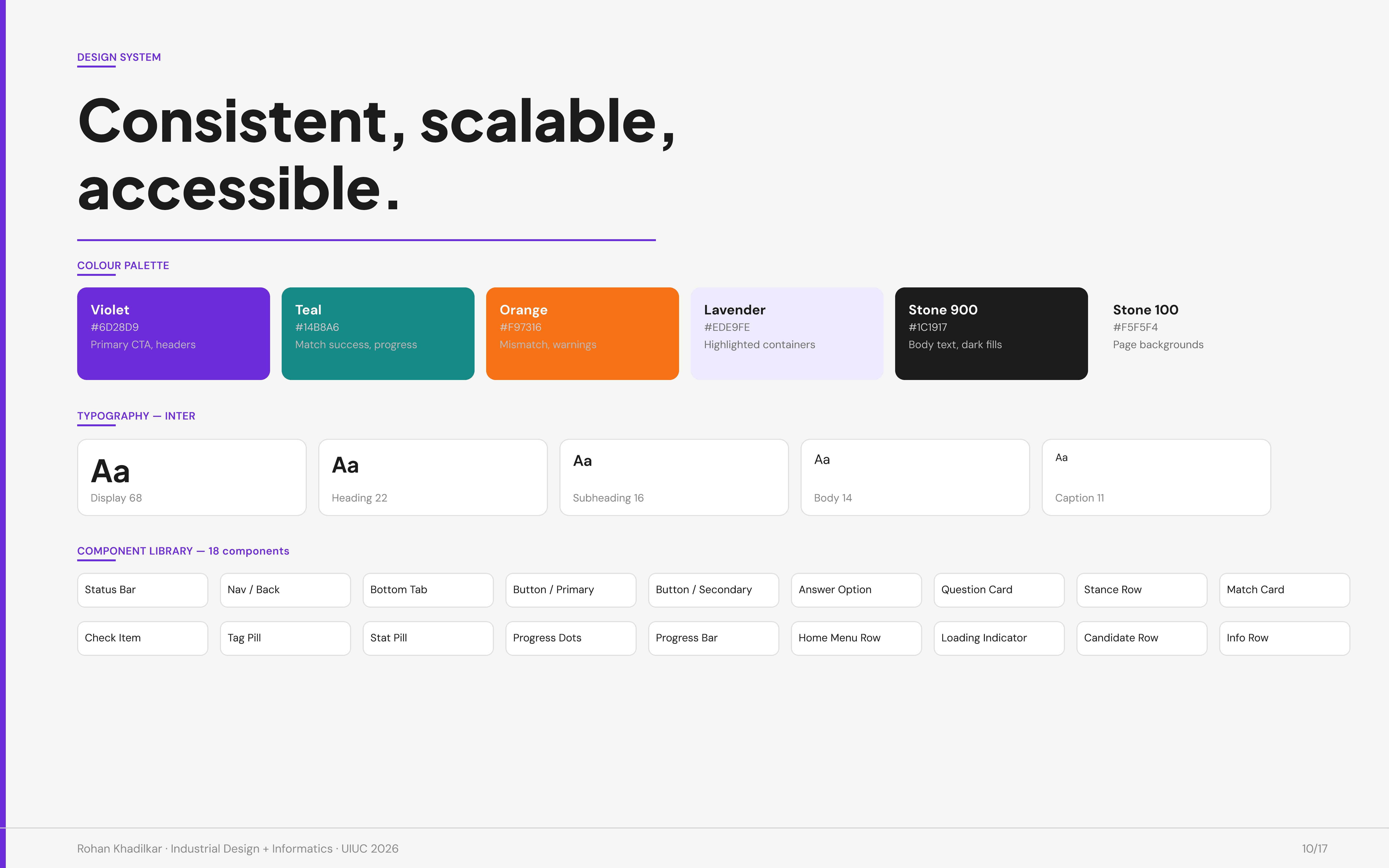
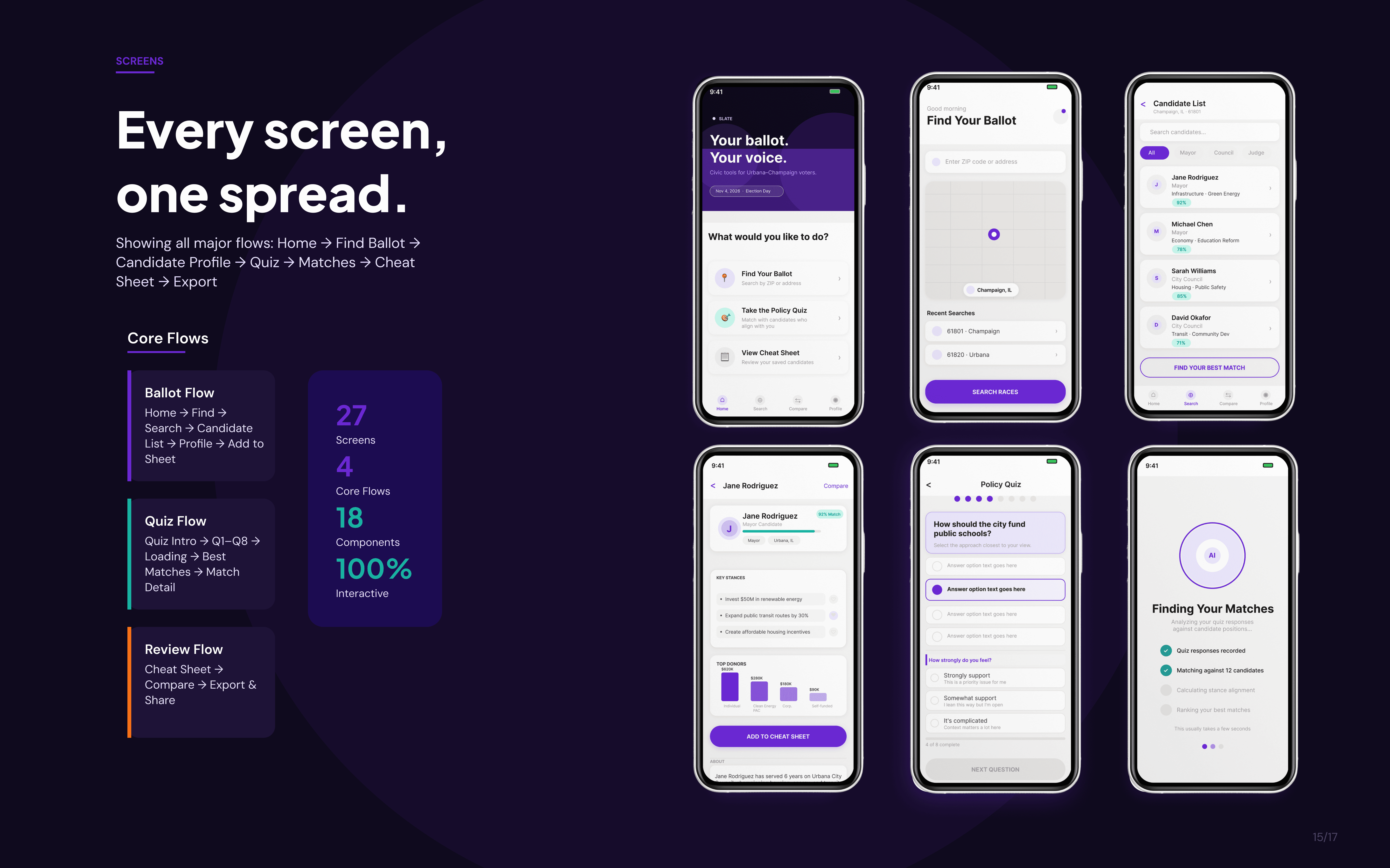
This was an end-to-end product design project covering user research, persona development, information architecture, a component library of 18 reusable components, and a fully interactive 27-screen hi-fi prototype.
challenge.
The research question driving this project: how might we design a mobile experience that reduces civic friction for voters aged 18 to 28, making candidate discovery and policy matching genuinely accessible?
Four structural barriers kept surfacing: time constraints, partisan bias in media, scattered information across sites, and a near-total lack of purpose-built civic tools for this demographic. The dominant framing blames apathy. The real problem is that the system was never designed with young voters in mind.
user.
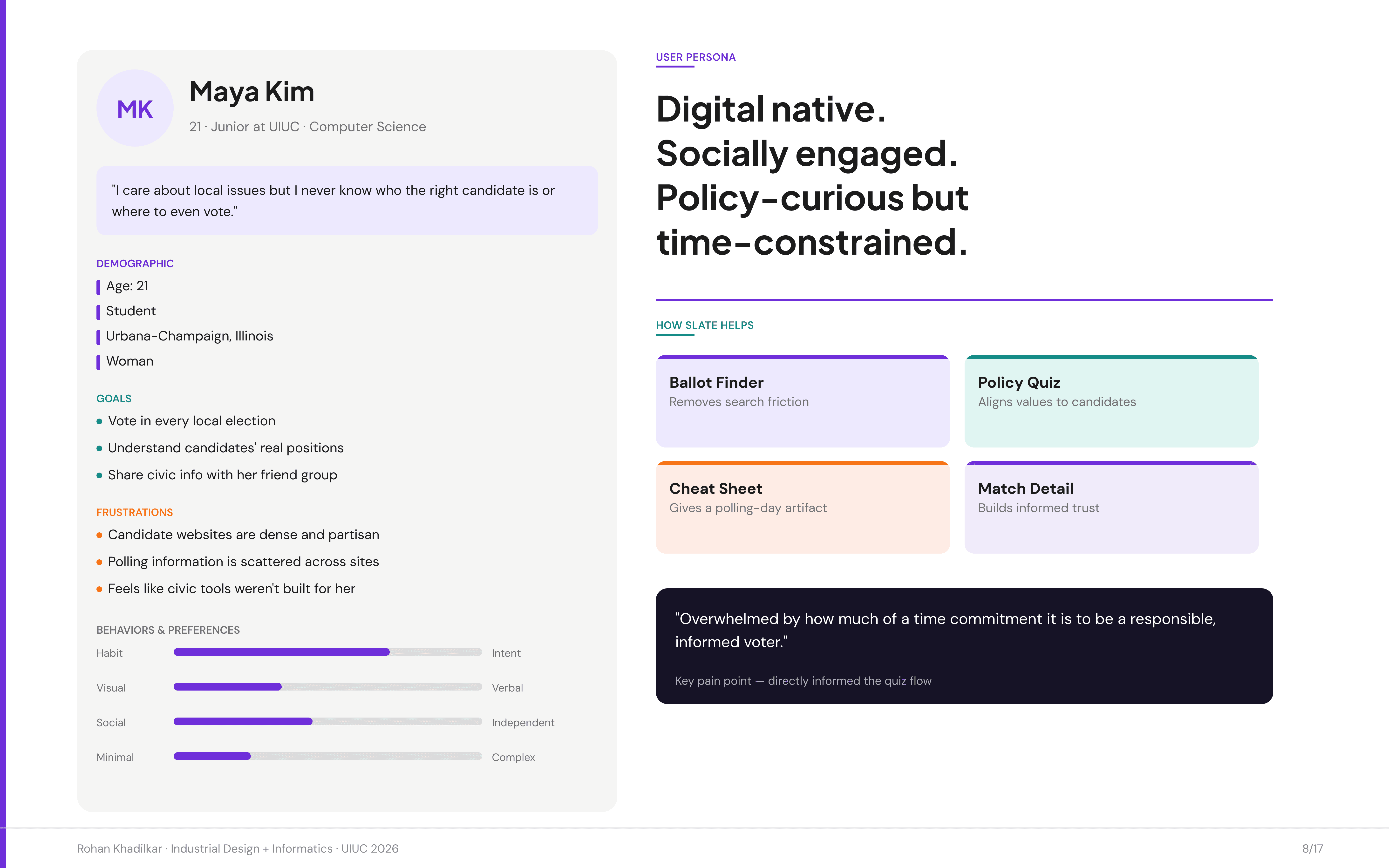
The persona that emerged from research is Maya Kim, a 21-year-old Computer Science junior at UIUC. She wants to vote in every local election and understand candidates' real positions, but candidate websites feel dense and partisan, polling information is scattered across sites, and civic tools weren't built for someone like her.
Her key pain point, quoted directly from user sessions: "Overwhelmed by how much of a time commitment it is to be a responsible, informed voter." That single quote directly shaped the decision to build the quiz flow as the core interaction, not a candidate browser.
research & exploration.
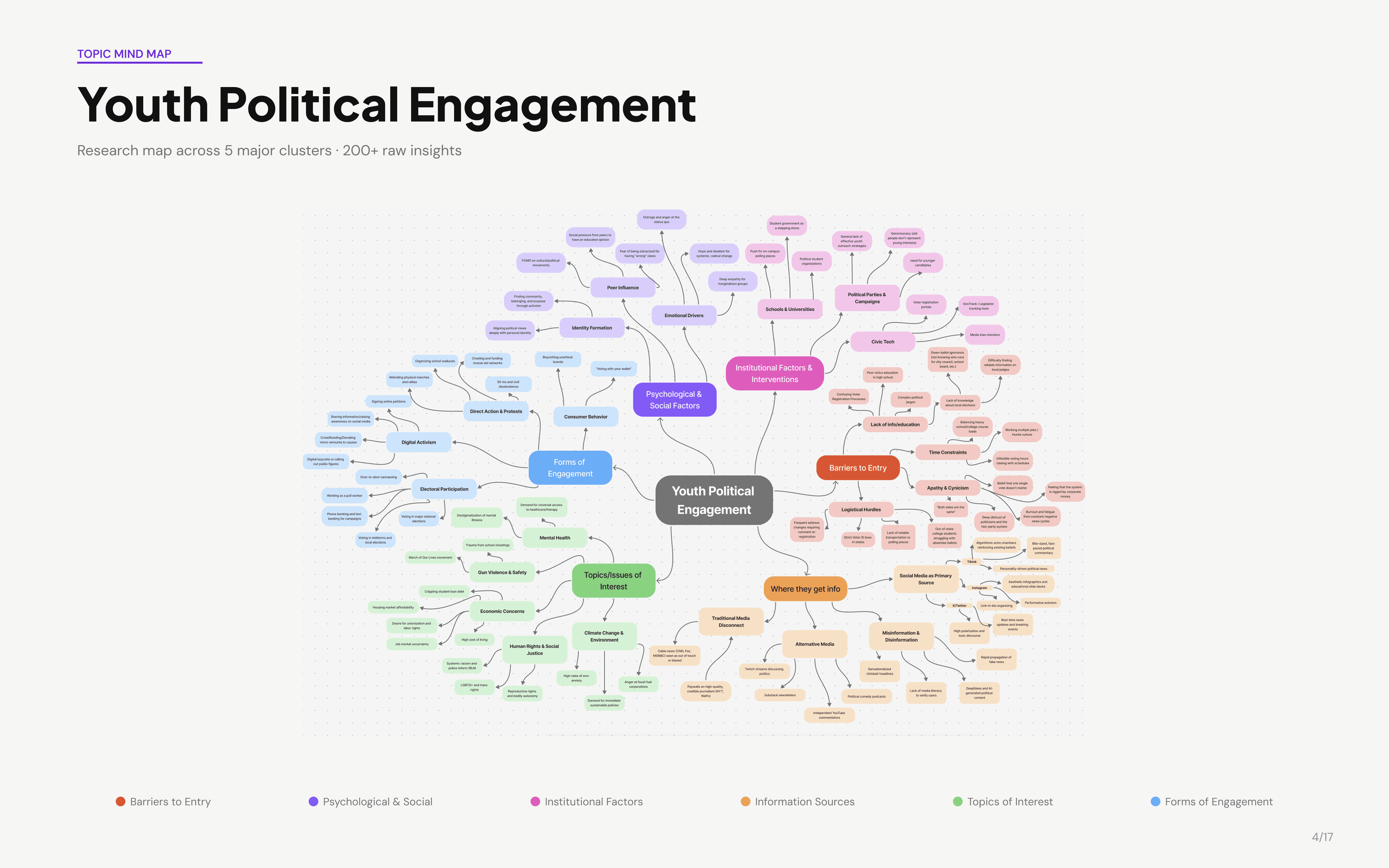
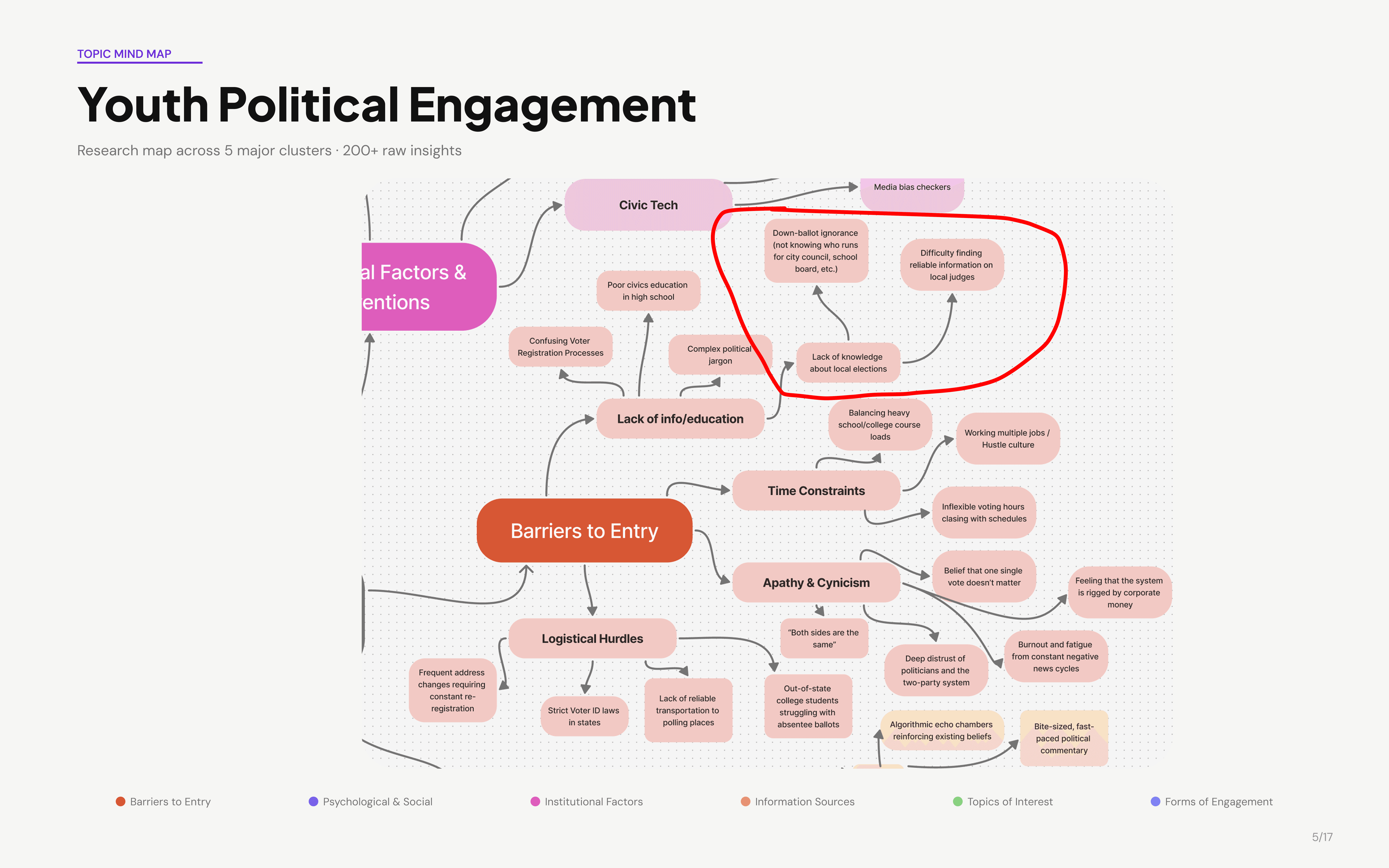
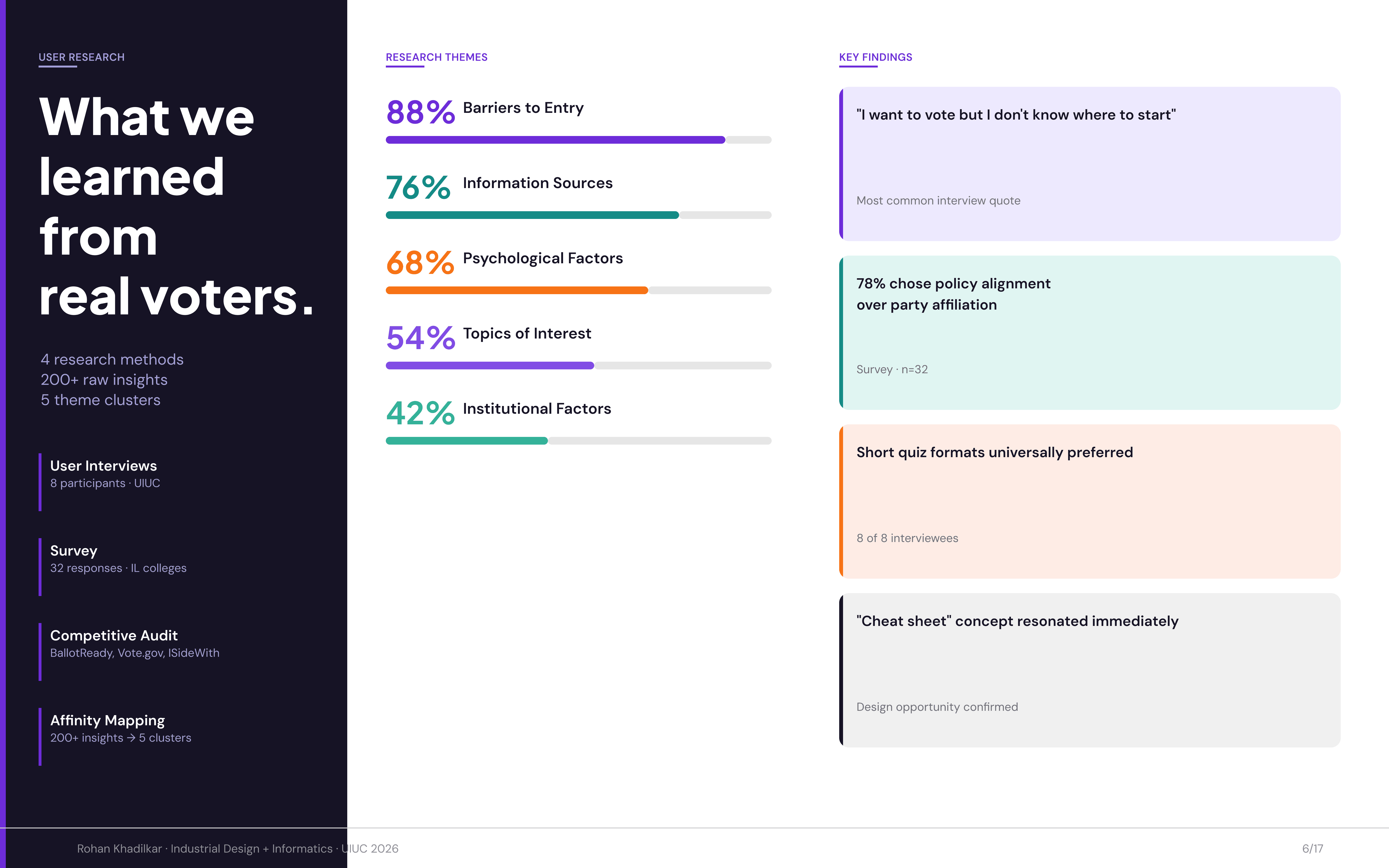
Research spanned four methods: 8 user interviews at UIUC, a survey with 32 responses across Illinois colleges, a competitive audit of BallotReady, Vote.gov, and ISideWith, and a full affinity mapping session that organized 200+ raw insights into five clusters: Barriers to Entry, Psychological and Social Factors, Institutional Factors, Information Sources, and Topics of Interest.
The mind map below captures the full breadth of that synthesis. The red circle on the zoomed view calls out the most actionable cluster for Slate: down-ballot ignorance and the difficulty of finding reliable information about local candidates and judges, sitting directly under the Barriers to Entry and Institutional Factors branches.
key insights.
Insight 01 — Barriers to Entry (88%) Nearly every participant cited the research process itself as the primary obstacle. Not political disinterest. The design response was a quiz-first model that generates candidate matches in under three minutes, so the research cost feels proportionate to a local race.
Insight 02 — Information Sources (76%) Most users first encounter local political content on TikTok or Instagram, but immediately distrust it. The design response was a deliberately nonpartisan visual language (violet and teal, no red or blue) and transparent data sourcing tied to Google Civic Information API, FEC filings, and Ballotpedia.
Insight 03 — Psychological Factors (68%) Users felt underprepared and overwhelmed before they even started researching. The design response was progressive disclosure: the quiz asks about issues users already have opinions on, and Slate handles the translation to candidates.
Insight 04 — Cheat sheet concept resonated immediately When presented with the idea of saving a personalized ballot to their phone, participants responded immediately and positively. This was a design opportunity confirmed directly in research, not assumed.
experience flow.
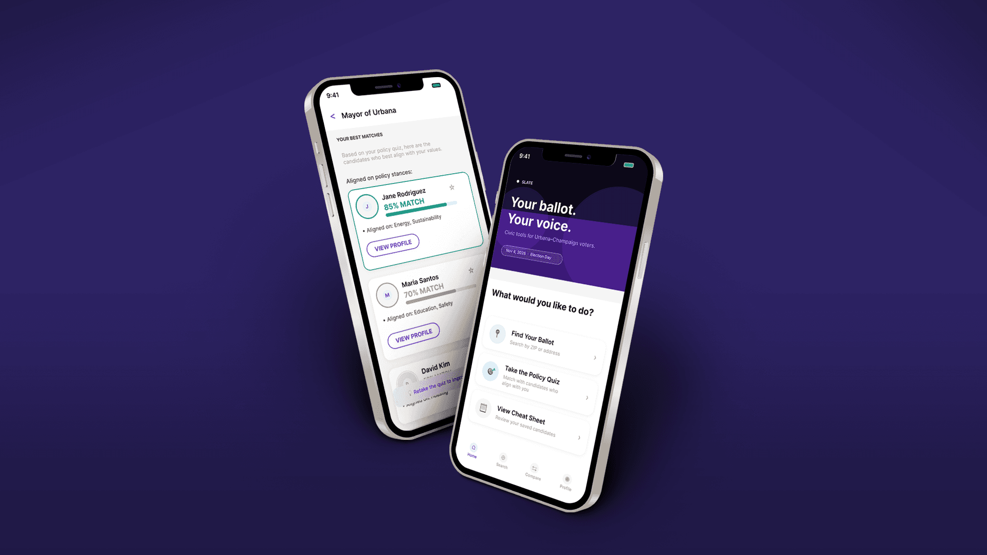
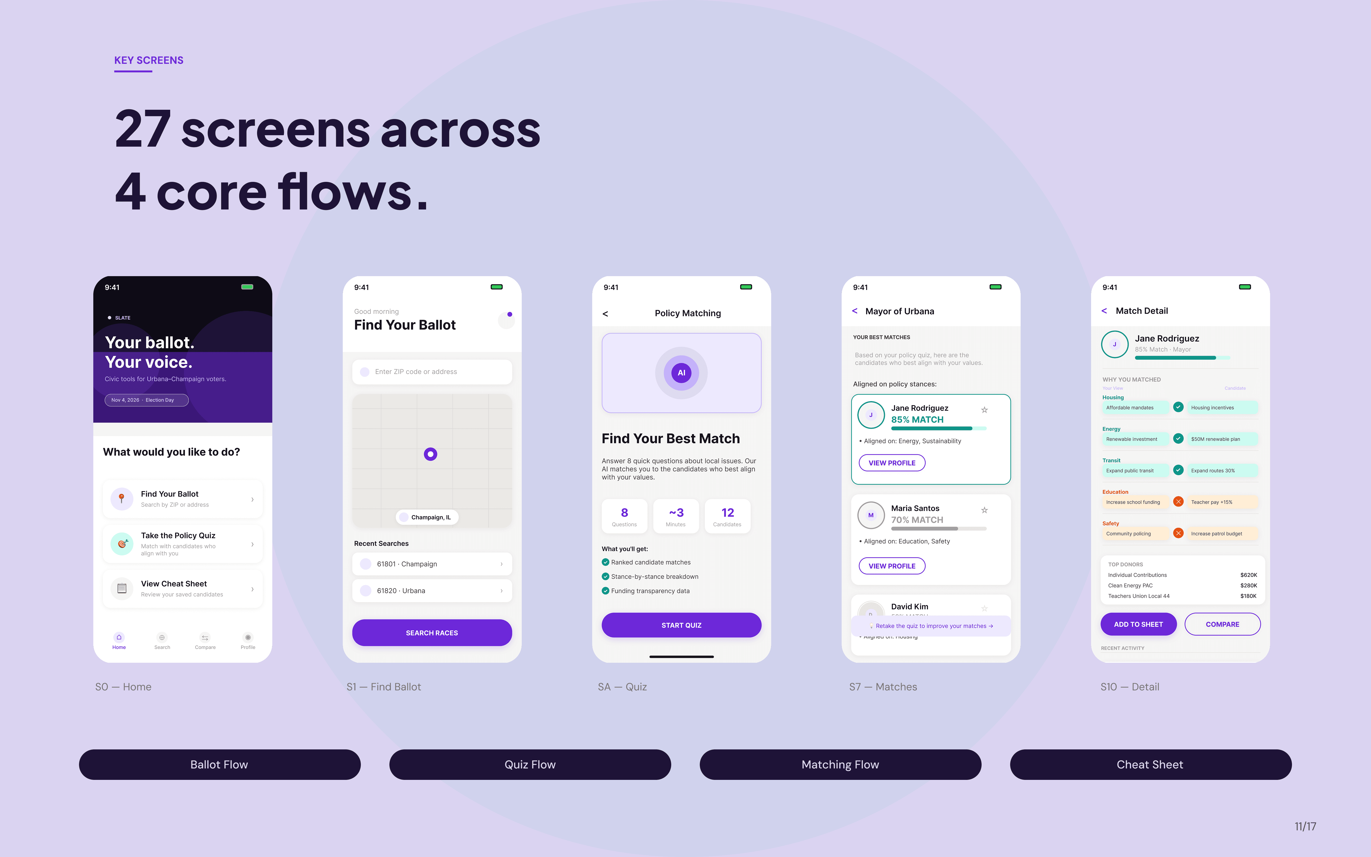
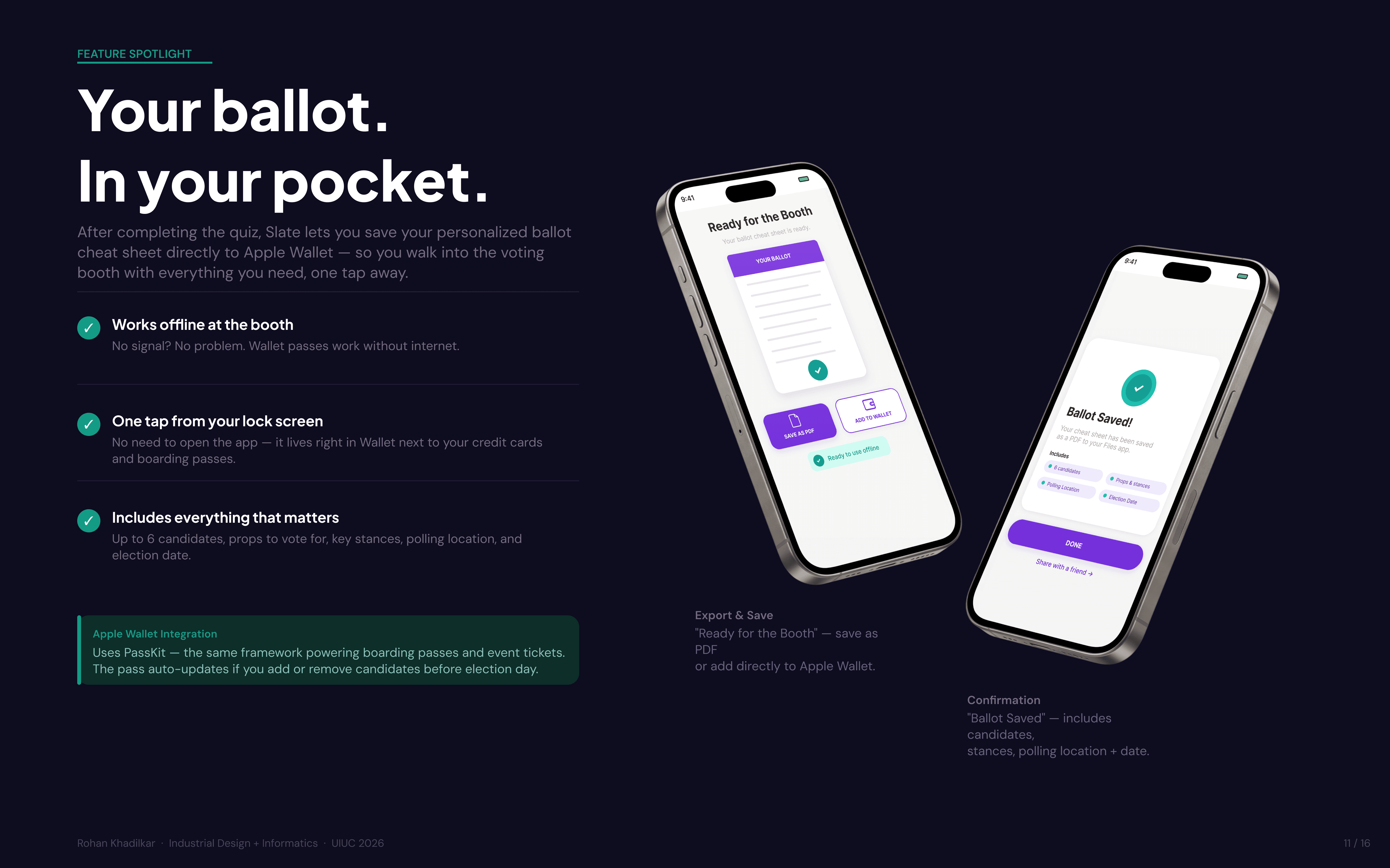
The core flow is linear by design. A user enters their ZIP code to pull their live ballot via the Google Civic Information API, takes the 8-question policy quiz, receives candidate matches ranked by alignment percentage, and can drill into any match for a stance-by-stance breakdown with funding transparency. Once they've locked in their choices, Slate generates a personalized cheat sheet that saves directly to Apple Wallet via PassKit, so their picks are on their phone when they're standing in the voting booth. The pass works offline and auto-updates if they add or remove candidates before election day.
Every screen was designed to reduce cognitive load: one action per screen, progress indicators throughout, and no candidate names or party affiliations shown during the quiz, so responses stay unbiased.
prototype evolution.
hi-fi prototype.
demo.
result.
Slate demonstrates that civic tech doesn't have to be bureaucratic or overwhelming. By starting with the user's values rather than the candidate's platform, and by closing the loop with a wallet-ready cheat sheet for election day, the design makes the full arc from discovery to booth feel achievable for first-time local voters.
The final deliverable includes 27 fully interactive screens across four core flows, 18 reusable components, a data integrity layer sourced from Google Civic Information API, FEC filings, and Ballotpedia, and an Apple Wallet integration via PassKit. The nonpartisan visual language and transparent match logic were the two design decisions most consistently noted in final review.