DATE:
05/08/2024
LENGTH:
8 WEEKS
ROLE:
SOLO
SERVICE:
INDUSTRIAL DESIGN, UI/UX DESIGN

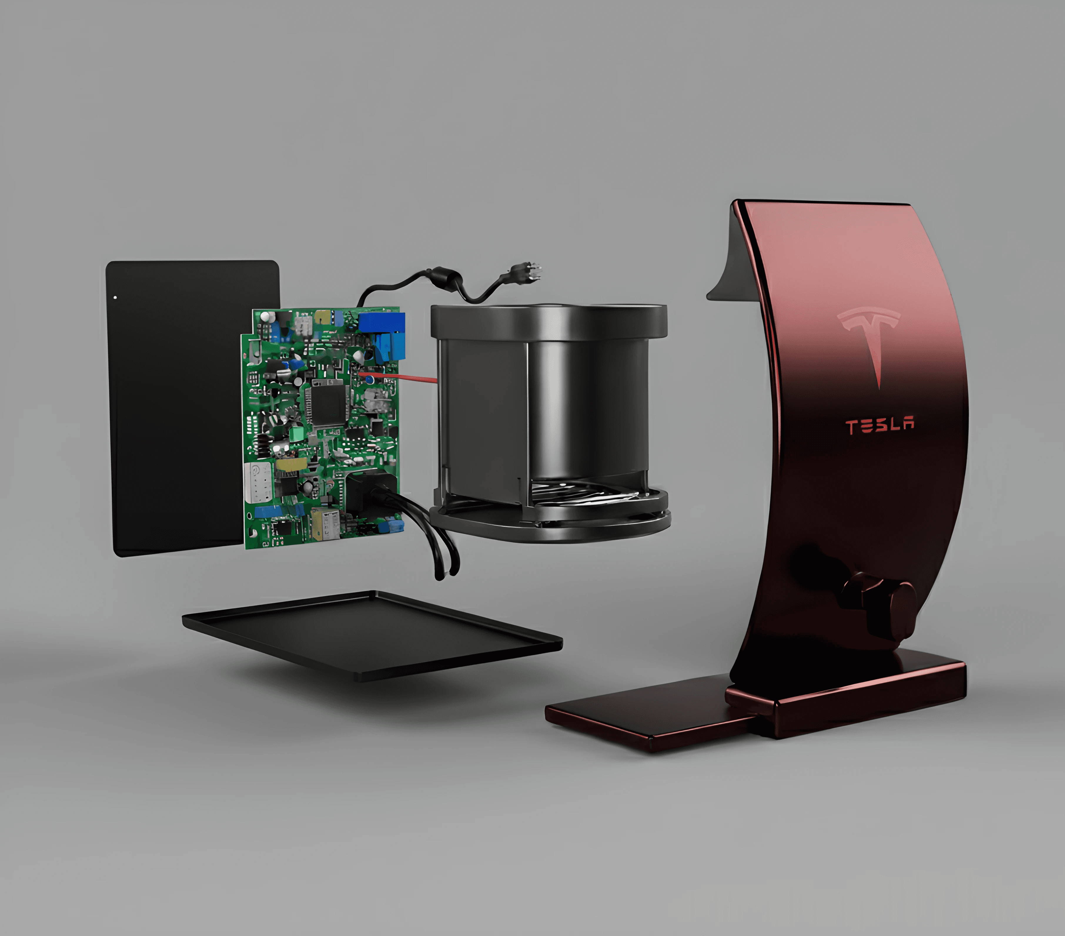
Model K
about.
Model K is a visual brand language exploration that imagines what an electric kettle could look like if it belonged in Tesla’s product catalog. Rather than designing a single appliance in isolation, this project focused on defining a cohesive form, color, and material system that aligns with Tesla’s design ethos.
The goal was to study how Tesla’s existing visual language could translate to a small, everyday household product. Model K became an exercise in restraint, proportion, and brand consistency, exploring how a familiar object can feel distinctly Tesla without relying on logos or overt styling cues.
challenge.
Tesla’s products are instantly recognizable, yet the company operates across vastly different scales and contexts. Translating that identity to a countertop appliance presents a unique challenge. Electric kettles are common, visually noisy, and often defined by exposed components and exaggerated forms.
The challenge was creating a visual language that feels premium, minimal, and technologically confident while still respecting the warmth and domestic nature of a kitchen environment. I needed to balance Tesla’s sharp, engineered aesthetic with approachability, ensuring the product felt intentional rather than out of place in the home.


results.
Model K resulted in a refined visual system that applies Tesla’s design principles to a small household appliance. The final design emphasizes clean geometry, controlled surface transitions, and a restrained CMF palette that mirrors Tesla’s broader product ecosystem.
Rather than focusing on novelty, the project demonstrates how brand language can scale down thoughtfully. Model K shows how consistency in proportion, material honesty, and visual quietness can make an everyday object feel elevated, cohesive, and unmistakably aligned with a larger brand vision.